
Discover 12 powerful responsive web design examples that inspire better user experience. Learn how to create mobile-friendly sites for better engagement today!
When was the last time you landed on a website from your mobile phone and had to pinch, zoom, or scroll endlessly just to read a headline? Chances are, you left that page almost immediately. That’s exactly what poor browser width handling and lack of responsive design can cost you—visitors.
Modern responsive web design eliminates this friction by using tools like CSS media queries, fluid grids, flexible images, and the viewport meta tag. These technologies allow a website to automatically adjust based on screen width, device type, and orientation, ensuring a consistent experience across smartphones, tablets, and desktops.
With mobile internet usage now accounting for over 58.7% of global traffic (Statista, 2023), adopting a mobile friendly design isn’t just ideal—it’s essential for SEO, user engagement, and conversion rates.
Expert Insight: “Your website’s only as strong as the weakest device you’ve tested it on.” — Ethan Marcotte, who coined the term responsive web design.
In this post, we’ll explore 12 stunning examples of responsive web design from global brands that effectively solve layout, content delivery, and navigation challenges using responsive images, smart relative units, and fluid layouts.
Ready to elevate your user experience?
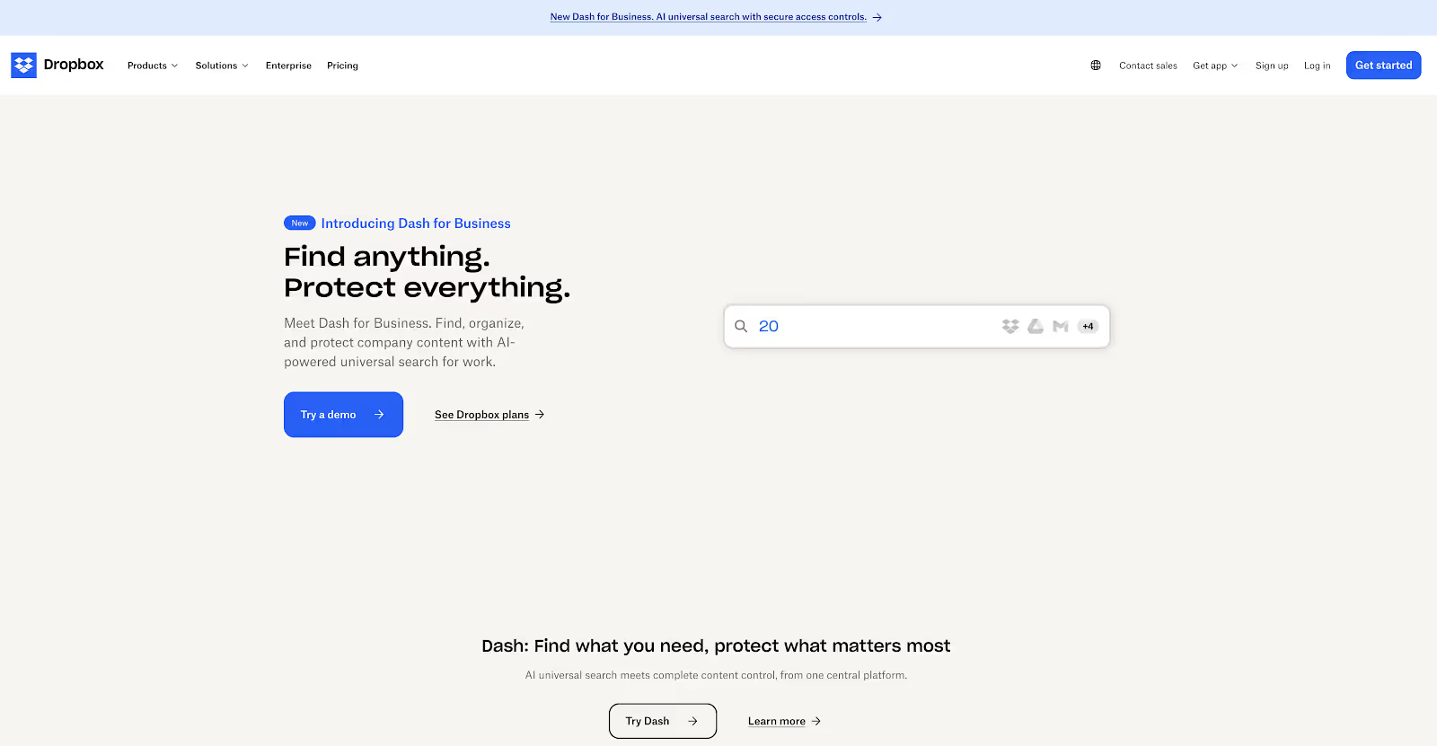
Dropbox leverages a fluid grid system and responsive typography to keep its minimalist interface clean across devices. The design adapts to changes in viewport width using media queries, while the CTAs remain perfectly positioned regardless of screen size.
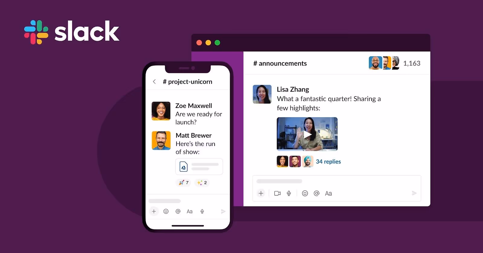
Slack’s website adjusts dynamically to browser window dimensions, with collapsible menus and icons that scale smoothly via relative units. The site showcases how responsive images and fluid layouts can simplify user interaction across platforms.
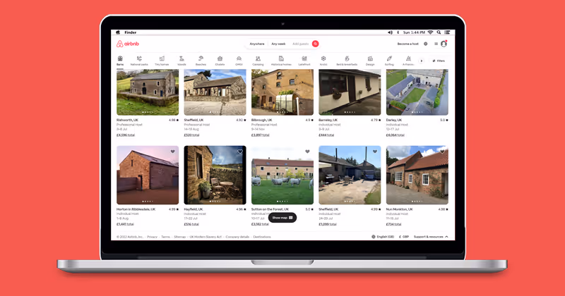
Airbnb’s design highlights the power of flexible images and responsive page structure. Their high-resolution imagery automatically resizes based on device width, providing a stunning and consistent visual experience across smartphones and tablets.

Apple’s sleek aesthetic is powered by a responsive layout built with CSS breakpoints and device detection. The use of max width property and fluid grids ensures that content looks sharp, centered, and legible across all screen sizes.

The Guardian uses a responsive site framework that emphasizes content clarity. Its implementation of responsive typography, adjustable font sizes, and optimized line lengths delivers a smooth reading experience—even on low-resolution or narrow screens.
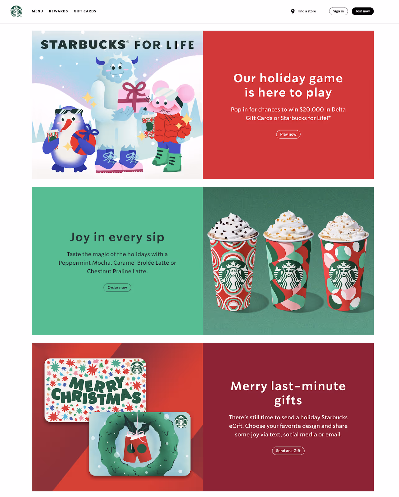
Designed with a mobile first mindset, Starbucks’ site employs media queries and device-specific breakpoints to render custom layouts. Its responsive images and interactive components scale elegantly while preserving performance and functionality.
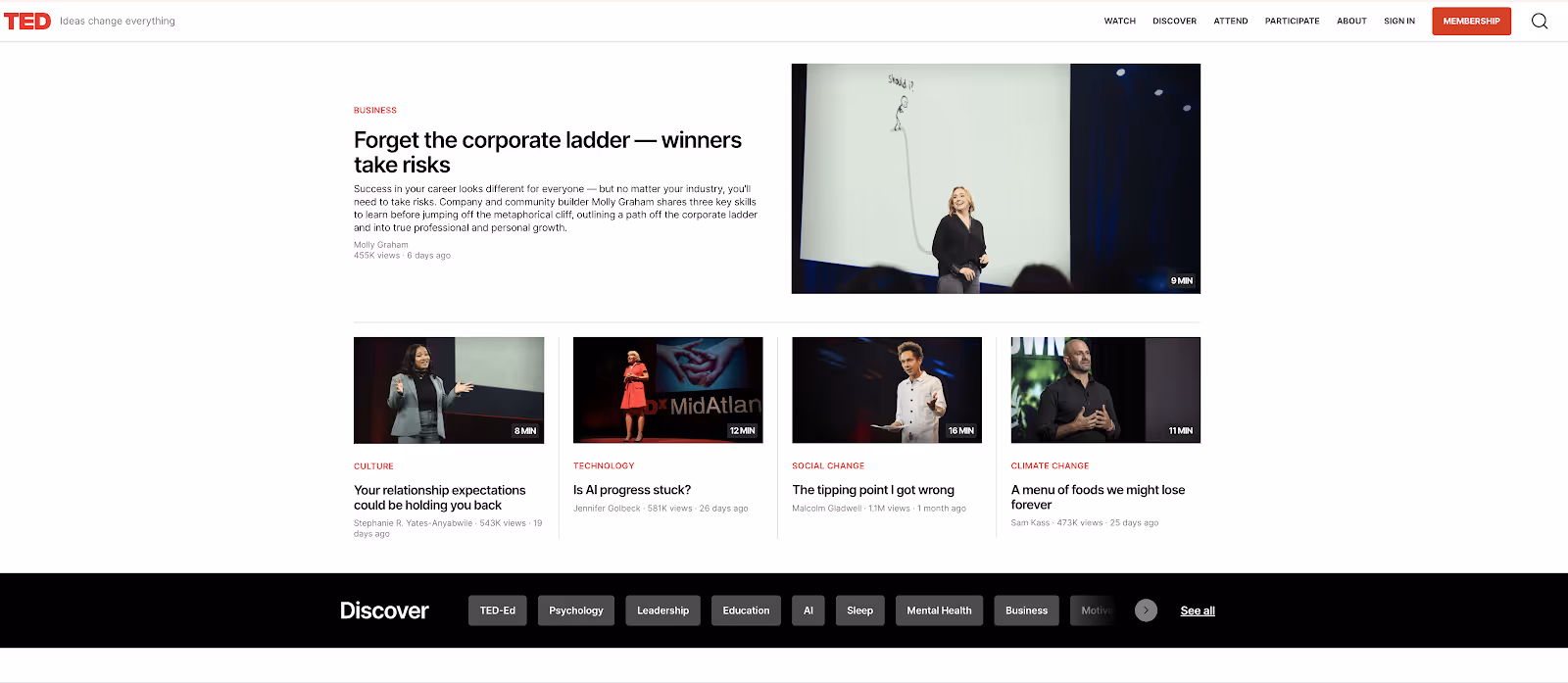
TED’s platform utilizes fluid images and automatically adjusting video containers that maintain aspect ratios across devices. The seamless delivery of multimedia is powered by viewport meta tags and flexible layout techniques.
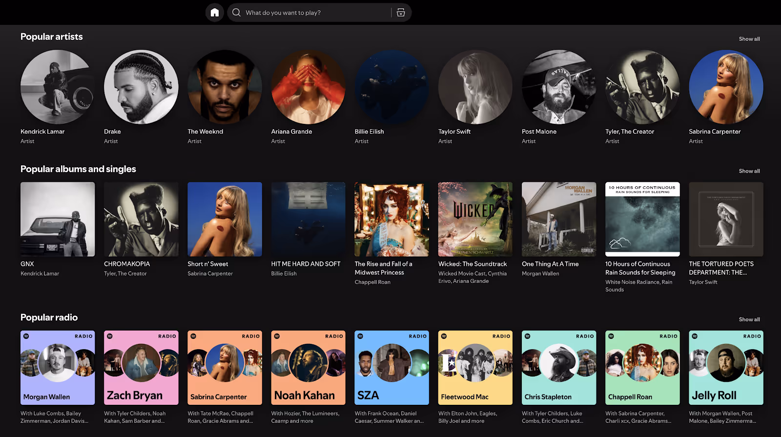
Spotify applies CSS layout alterations and responsive design principles to enhance its personalized UX. From mobile playlists to desktop dashboards, the responsive grid ensures intuitive navigation and uniform performance.
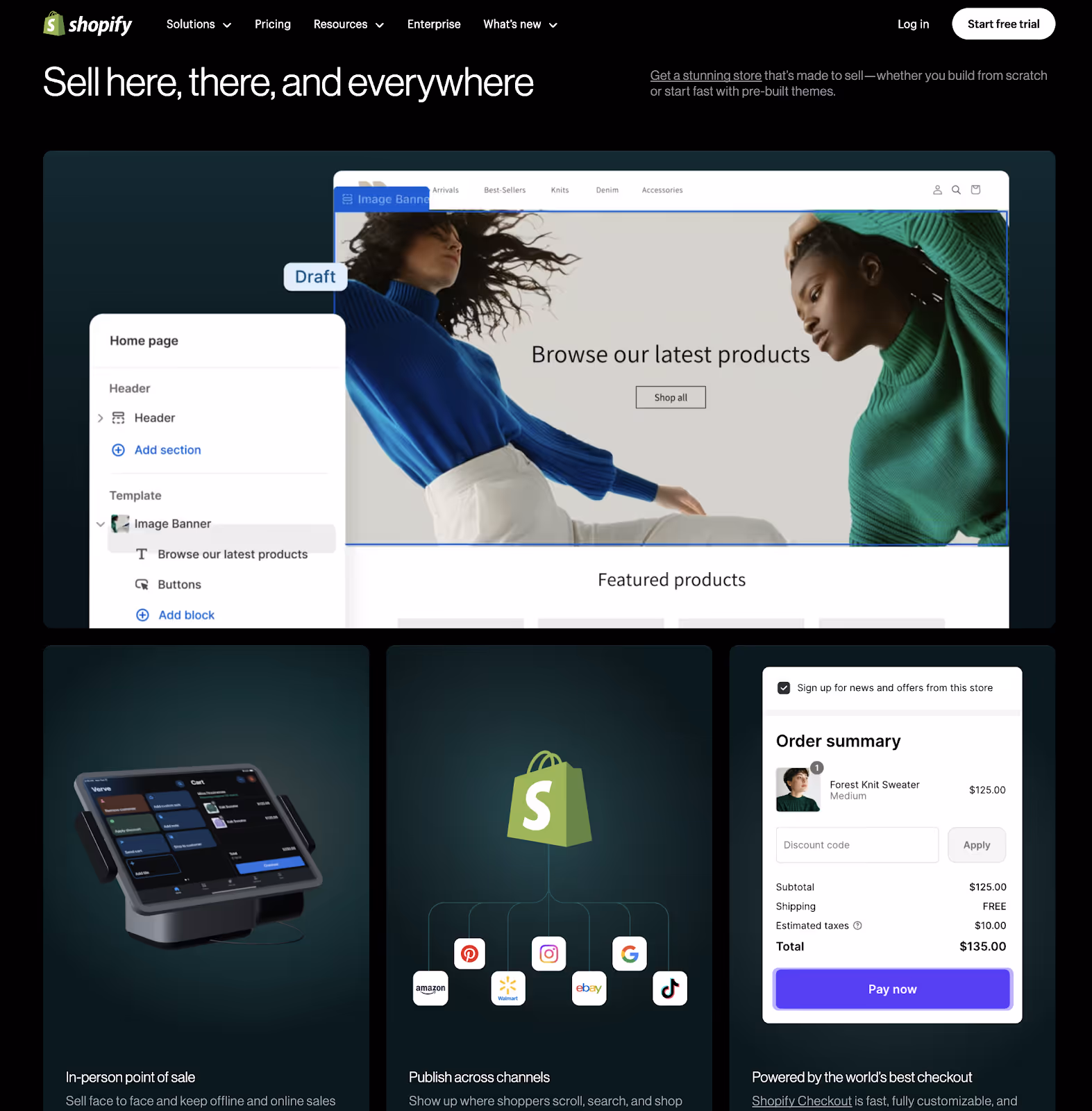
Shopify embraces browser width adaptability and modular design. Product descriptions, CTAs, and checkout flows scale intuitively via multiple media queries, supporting high conversion rates on any screen.
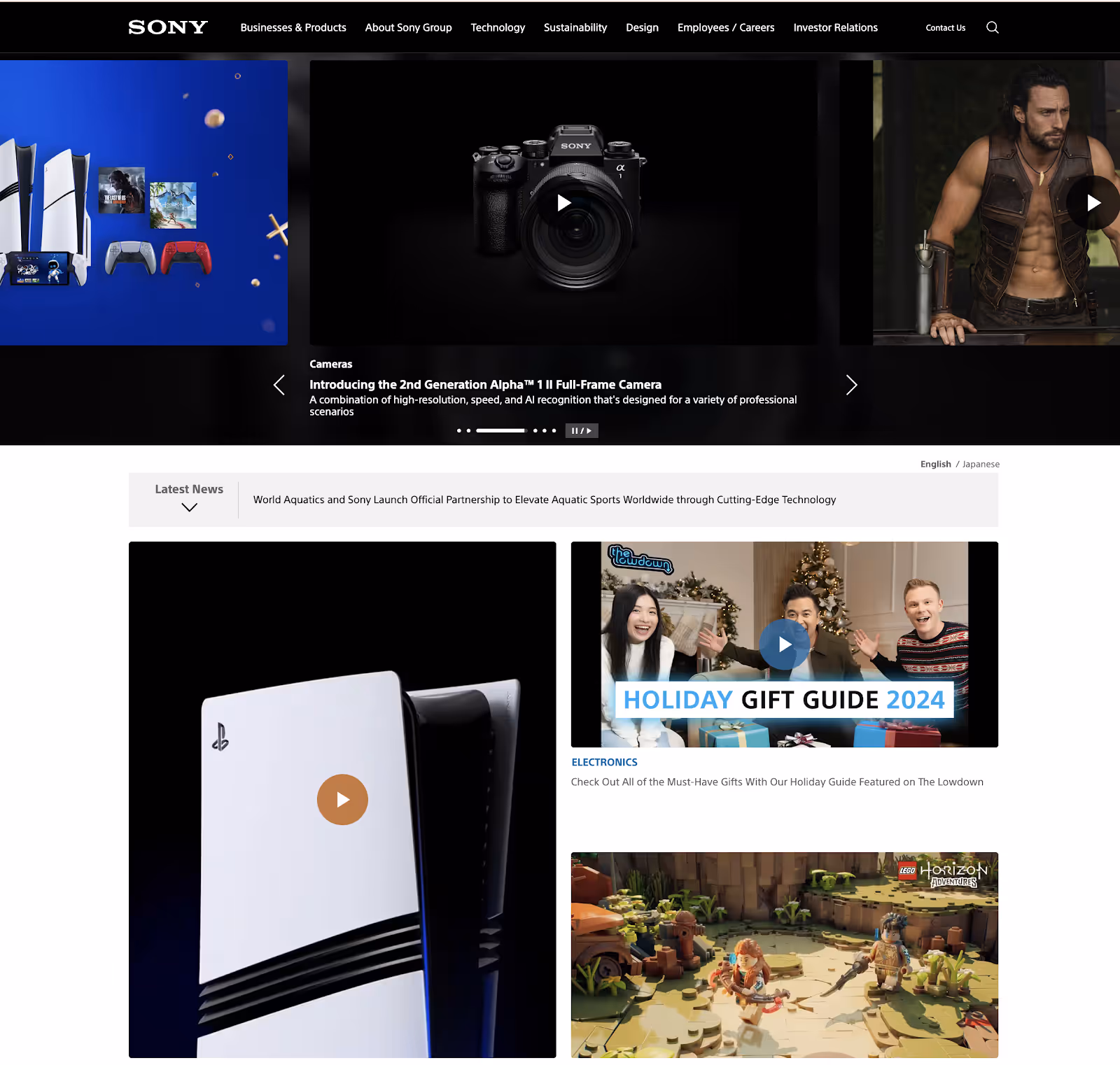
Sony’s site applies responsive typography, multiple column layouts, and expandable menus to accommodate wide product categories. This is enhanced by screen width detection and breakpoint-based rendering.
Unsplash leads with responsive images and an adaptive masonry-style grid. Whether viewed on a desktop or a phone, images are resized and delivered proportionately using resize images proportionately and fluid layout logic.
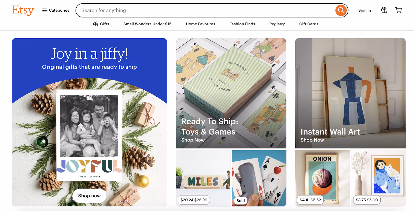
Etsy's use of flexible layout techniques, responsive filters, and scalable buttons provides a clean and easy shopping experience. Its implementation of CSS media queries ensures consistent performance across desktop and mobile devices alike.
Ready to Build a Modern, Responsive Site?
Start creating a mobile-first, accessible experience that delights your users.


Each example follows a mobile-first approach, where designs are created with mobile phones in mind before scaling up for larger screens. By using media queries, viewport width detection, and device-specific breakpoints, these websites ensure that users get fast, touch-friendly, and automatically adjusted layouts—whether on a phone, tablet, or desktop.
Expert insight: “It’s clear. Responsive is the way to go. One website for all screen sizes, for all devices. But what does it take for a company with an pre-existing site or pre-existing way of working together to make the needed changes to go responsive?” – Karen McGrane, content strategist and accessibility advocate
These responsive sites apply consistent CSS features like fluid images, browser window adaptation, and responsive typography to create a unified experience. Navigation, readability, and performance remain smooth regardless of browser size or device type.
Rather than overloading with design gimmicks, these examples demonstrate how flexible layout principles, basic CSS, and modern web technologies can deliver clean, creative designs. They strike a balance between form and function—proving that responsive web design doesn’t need to be complicated to be effective.
Building a responsive site starts with the right technical foundation and user-focused mindset. Here’s how you can apply the same best practices:
Plan your design around mobile version constraints and scale up using CSS media queries. This ensures content clarity on small screens before adding enhancements for wider layouts.
Define breakpoints based on device width, browser width, and portrait orientation. Use media queries to adapt layout components accordingly.
Instead of rigid pixel-based widths, use fluid grids and relative units like percentages or em to make containers and text scale with the screen.
Apply srcset, resize images proportionately, and compress visuals for faster load times across screen widths and resolutions.
Use testing tools like Google Mobile-Friendly Test, BrowserStack, or viewport simulators to ensure consistency. Check how your layout behaves during browser resize and in multiple orientations.
Whether you’re launching a blog, e-commerce platform, or SaaS dashboard, responsive design should reflect your brand identity while ensuring accessibility across multiple devices.
Taking cues from brands like Apple, Spotify, and Shopify is a great starting point—but your responsive site should meet your unique business goals, audience behaviors, and platform requirements.
Need help tailoring responsive design to your brand?
From fluid layout systems to mobile-first wireframes, our experts can help.


.avif)


