Design is in the details—fonts, colors, visuals, and more. Inconsistencies reduce business credibility, add to technical debt, and nullify marketing efforts.
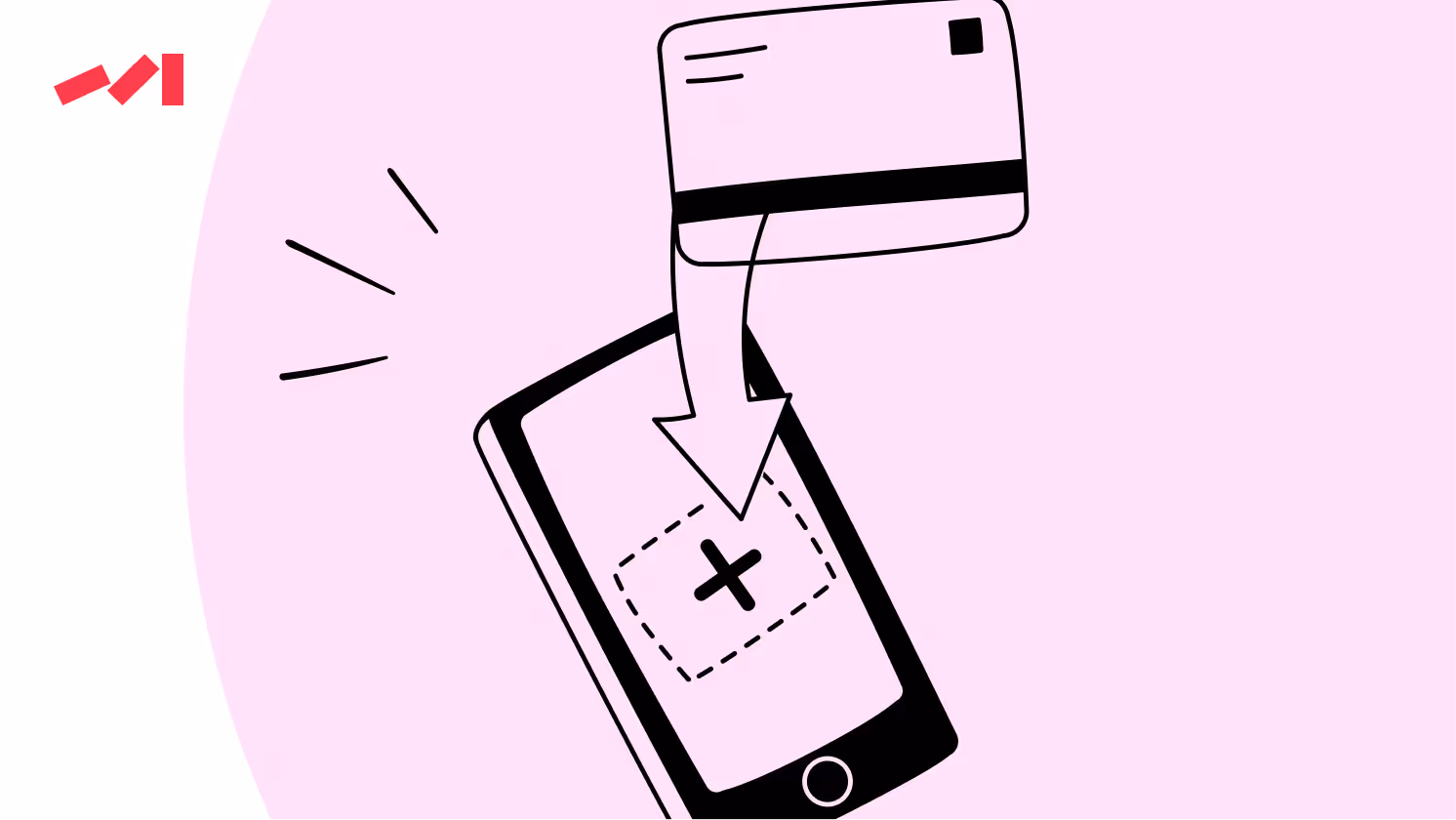
Did you know that images, color, and video are the most popular visual elements on websites? The 2021 report from Top Design Firms shows striking numbers: most consumers (40%) favored images, 39% valued color, and 21% voted for video.

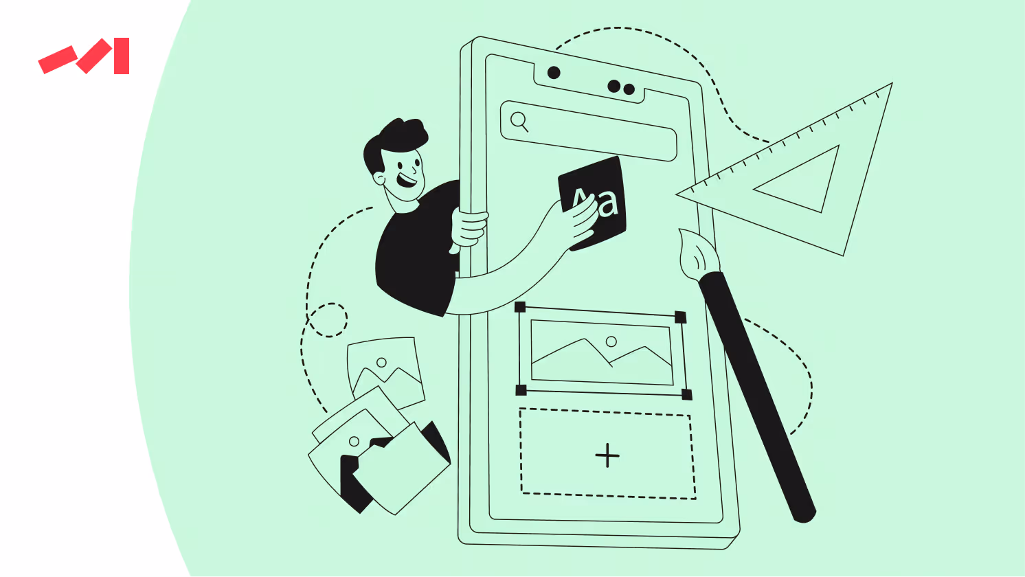
With that in mind, some might have realized that crucial elements on their sites are far from abundant. Well, while your company should undoubtedly prioritize adding more images and other visuals, namely video, infographics, or animation, don’t close the article and rush off!
When it comes to web design, partially deployed on-page facelifts do more harm than good in the long run. Sharp swings in strategies, adding new elements or blocks of content seemingly resolving all the issues — fresh designers who alternate one another… All this inevitably leads to design inconsistencies.
You may wonder: What’s wrong with inconsistent design elements? And what are the consequences? Then, keep on reading.
If curiosity kills the cat, design inconsistencies kill the user experience across the website or on the page. If only it were the only problem! User experience, though extremely important, is just one of the many consequences. For instance, it may not seem obvious, but technical debt is constantly growing while more and more new design elements, clashing with outdated ones, appear on the website.
But all in good time, let’s take one reason at a time!
There’s no secret: a seamless user experience relies on consistent design patterns and interactions throughout the product. Yet, at times, marketing teams develop quick-win strategies to capitalize here and now that neglect some other less critical section on a page. Over time, neglected sections become a thorn in the marketing side as they retain outdated functionalities or navigation structures, leading to usability issues and frustrating user experiences.
Additionally, users may need to be more consistent in how they interact with different parts of the product. If certain product sections are left unchanged, users find themselves baffled and puzzled — their attention away from the product.
So, even if facelifts work and capture users' attention, their impact is, in essence, short-lived. After initial curiosity, the user starts exploring the page more, only to find visual inconsistencies between various sections.
It’s not rocket science: design inconsistency disrupts a product's visual flow, causing user confusion and detracting from its overall appeal. With different sections having various design styles or aesthetics, users wonder if your offerings are worth investing in. That’s why cohesive design is so crucial! It helps businesses to establish trust, credibility, and professional ethics.
Haven’t you already forgotten about technical debt? In this case, it’s mainly about the cumulative cost of postponing necessary design and development work — the inevitable price to pay for facelifts instead of maintaining the entire design consistency.
Evidently, the more sections are left untouched during a facelift, the more the technical debt. There’s another bit to it: over time, technical debt can slow down development cycles, increase the risk of errors, and impede innovation as resources are diverted to managing legacy systems. So, think twice about marketing easy pickings!

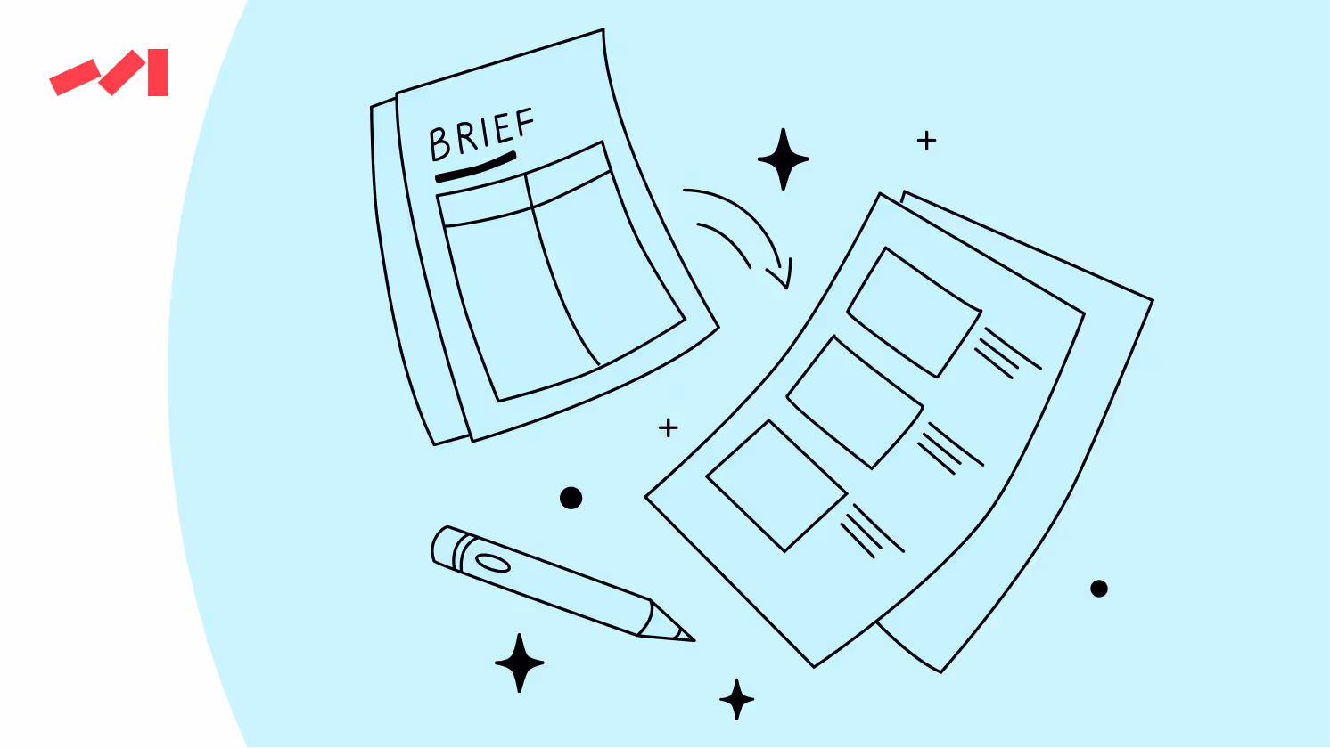
Depending on the task scale, be that a complete audit across the website or the desired pages (which obviously does not resolve the more significant inconsistency issue), we split the process into two critical phases.
Reviewing all product sections and features to identify areas not addressed in the previous facelift is a complex process that usually begins with visual consistency analysis. This includes:
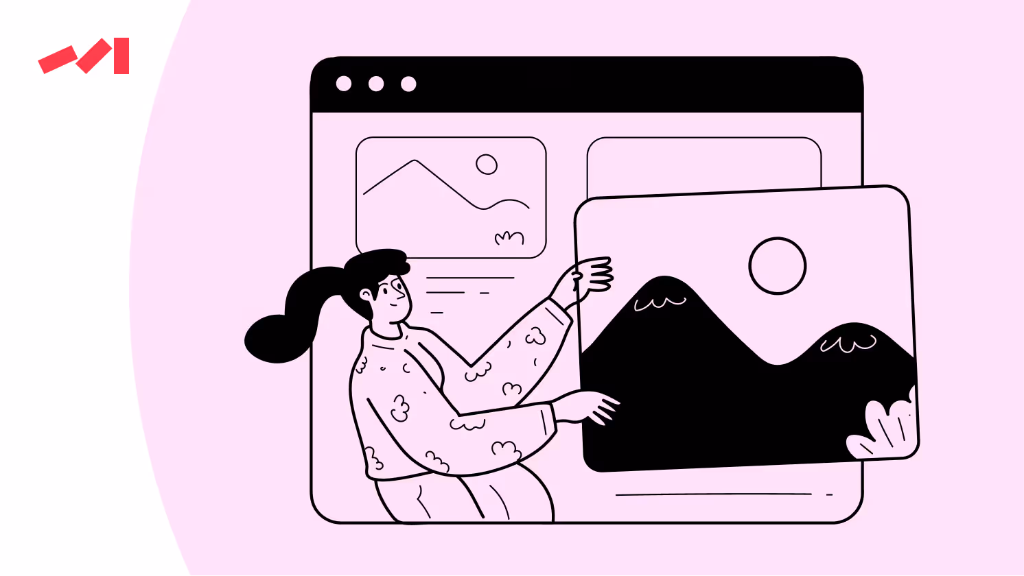
Needless to say, consistency in color schemes, typography, and imagery creates a unified and recognizable brand image. Colour schemes are particularly integral (39% of consumers value them the most!) in ensuring visual consistency.
Next up is usability and accessibility evaluation. It aims to guarantee the product is user-friendly for all users and platforms. What to follow in this step?
We also shouldn’t overlook content and messaging. In the comprehensive product design audit, each detail matters, let alone the content! The conveyed message, tone, and voice of the brand deserve to be meticulously analyzed to provide smooth and spot-on messaging.
The more data we gather, the more clarity we gain. We recommend starting small, only with the desired pages. Why? Each product has its story — a piece of the puzzle. While keeping the bigger picture in mind is crucial, don’t risk creating even more chaos.
Develop a roadmap and set up design guidelines and standards to ensure consistency across all product areas to guarantee:
The guidelines will mainly come in handy for product pages as, in most cases, on-page elements are pretty universal:
The last yet most challenging step is to ensure seamless integration with the existing product interface and user flows. Bear in mind that sometimes it’s better to redesign the entire product design, especially if your metrics ring the alarm bell!
Quality design is key to effective marketing. It captures attention, increases engagement, and drives conversions.
Before you go, subscribe to our newsletter to learn how strategic design decisions can transform your marketing efforts and help your business stand out.
Don’t miss out on the opportunity to learn more and stay updated on the latest trends!
Book a free 30-minute call with Darwin's Head of Design to brainstorm and fire off questions about the project you're racking your brain about. In this session, you'll gain a design concept idea developed on the spot, providing a solid starting point for your design journey.
Book a Design Concept Idea Call


.avif)