Mobile devices account for the majority of global website traffic. Discover where you lost the lion's share of mobile revenue and learn how to bounce back.
How often has your heart sunk when, smartphone in hand, you tap on a link only to see misplaced text, cut-off images or, worse yet, a pure blank screen that leaves you wondering if the page will ever load? Jokes aside, these situations are incredibly frustrating and, surprisingly, not relics of the past. Yes, despite all the advances of the 21st century.
For businesses, sticking to a mobile-last strategy is akin to signing a declaration of failure.
Mobile devices contributed 66.88% of global website traffic in March 2024, while desktop traffic share was only 31.42% — less than half as much!
More to it: over the last 12 months, mobile drew the biggest chunk of new users, 70%, and generated the highest score of returning visitors, 78% (according to Dynamic Yield fresh data). So, evidently, people, aka users or consumers, spend hours each day browsing social media, reading news, chatting with friends, and — no less importantly — seeking answers and solutions to their needs.
Thus, it’s immensely important to make web design and UX for mobile users clean, easy to navigate, and sticky, let alone have a neatly optimized website for mobile in the first place.
Today’s fast-paced digital competition doesn’t forgive strategic mistakes. If businesses fail to optimize web design for mobile devices, they will bear the brunt — extremely frustrated users, higher bounce rates, and low ranks in search engines, to name a few.
Particularly, the killer of the user’s joys is poor usability on mobile devices. This directly contributes to customer drop-off and missed revenue opportunities. A revelation? Users with phones in their hands expect nothing but a seamless, intuitive, smoothly flowing experience that takes them further down their journey with each succeeding tap.


What irritates them most, then? Small touch targets like those CTAs you can’t hit even with your little finger. Also, what about difficult-to-read text? Are you enjoying straining your eye muscles or playing zoom-in and zoom-out? Without fluid adaptation to screen dimensions, regardless of the cellphone brand, websites look like bricks of content scattered chaotically across the screen. If responsiveness is the key, then the lack of it is indeed the killer.
Even though hunt-and-peck typists are still among us, they are far more fluent on mobile devices. Aren’t we all? Our thumbs have perhaps grown more flexible than our spines! That’s why we are so quick to identify troubles with navigation menus, contact forms, search bars, etc. If these features become our pains, we aren’t going to bother sticking around — away we go.
Let’s be frank: when we struggle to interact with a website, we don’t think twice — we move on to a better one, meeting the essential usability standards. That’s where lost mobile revenue and missed opportunities stem from.

A few times in consultations with Darwin’s Head of Design, we heard this question asked by marketers from various companies: How do I optimize my website for mobile without changing anything? Without changing anything, you can only expect nothing to change. As simple as that.
Below, we outlined a structured approach for addressing and resolving common mobile usability problems to enhance your mobile performance and user experience.
Start by examining the essential elements: your mobile site's current layout, navigation, interface, and user flows. While doing so, look for streamlined, intuitive designs that facilitate quick and easy browsing.
Pinpoint exact examples where usability and responsiveness fall short. Elements like complex navigation paths or slow response times on touch interactions are the ones to keep your eye on.
Even though obvious, this is often overlooked: establish a set of principles to ensure that website elements and content scale effectively across different devices, screen sizes, and resolutions.
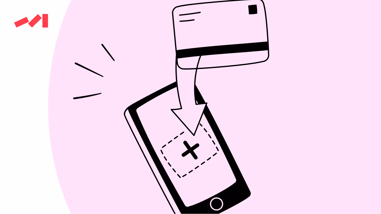
Confirm that key functionalities, such as menu accessibility, form inputs, and call-to-action buttons, are easily operable on mobile devices.
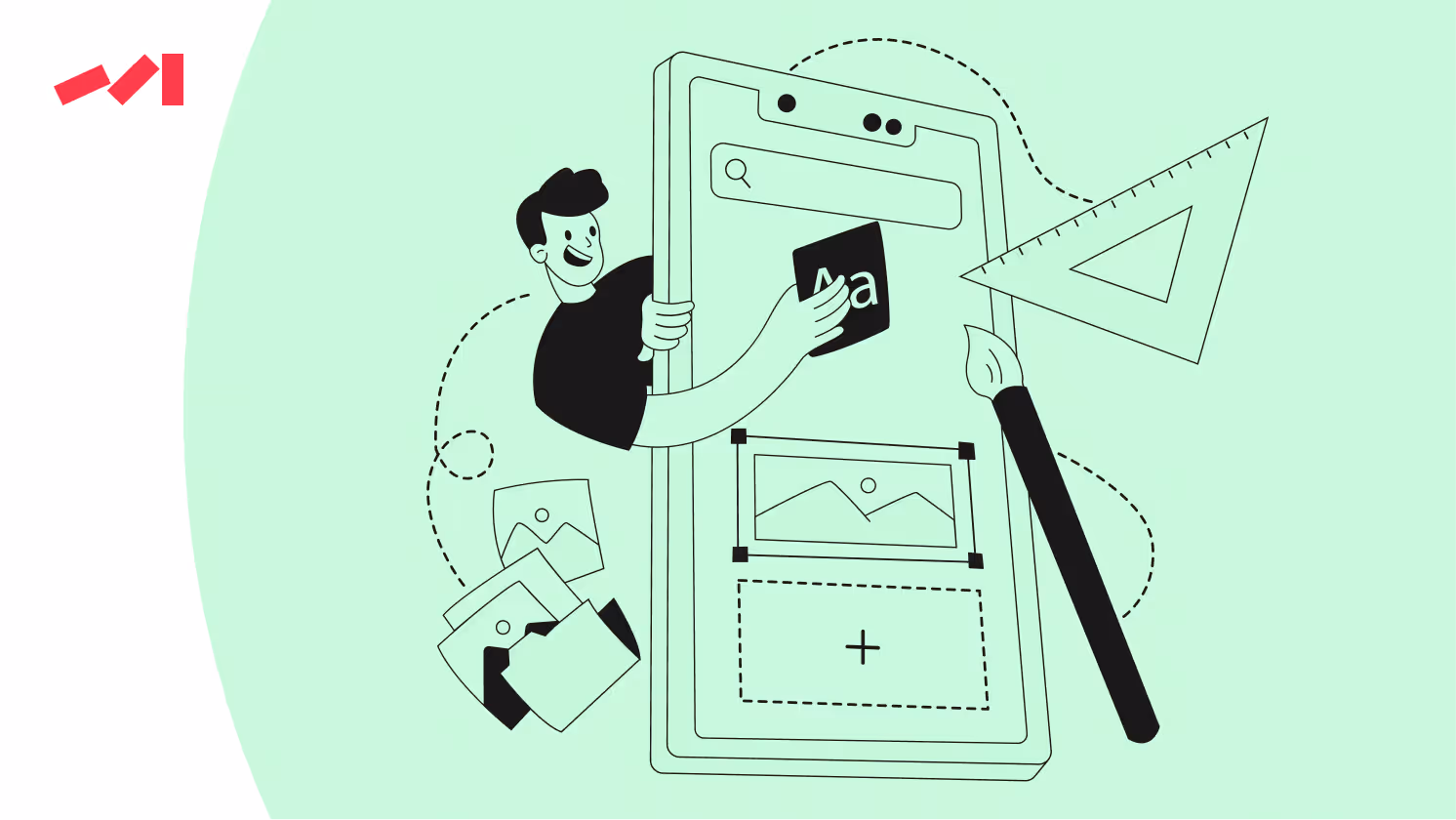
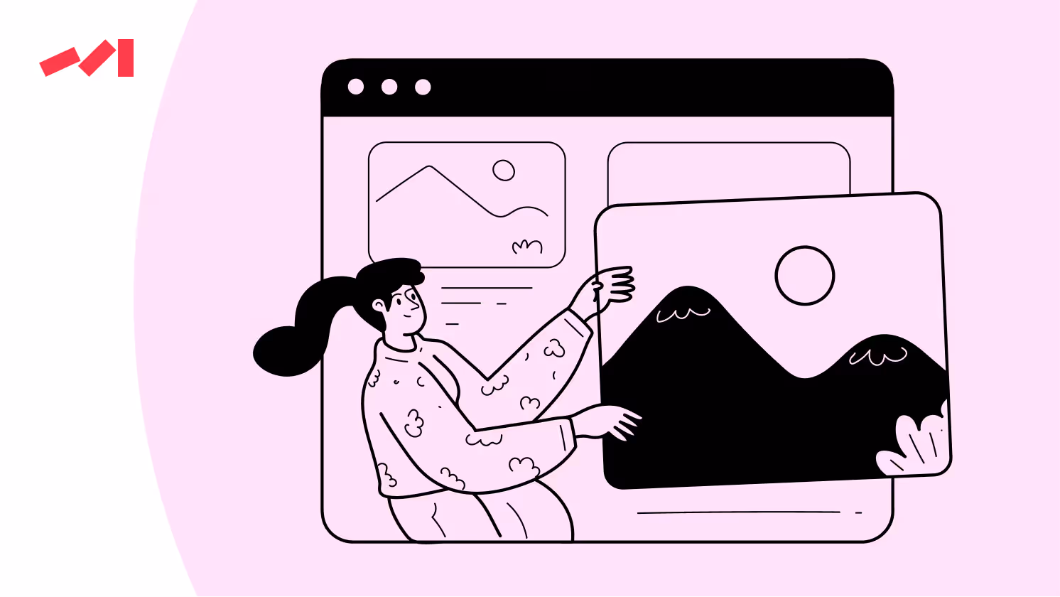
Apply responsive design best strategies to enhance the mobile website layout and user experience. Fluid grids, flexible images, and CSS styling that adapt to the user’s device increase your chances of catching their undivided attention.

Have you heard about Scalable Vector Graphics (SVG)? It's a nifty tool for creating simple graphics like logos, icons, and infographics.
Test the website’s responsiveness across a range of mobile devices and screen sizes regularly to ensure a consistent user experience. It may sound trivial, but testing goes a long way.
Regularly test your mobile site's usability with real users to identify and fix pain points.
Strive to optimize the mobile site’s performance. 85% of website users expect the mobile website to be faster than its desktop analogue, with a loading time of just 2 seconds or less. So, make sure your website is optimized for speedy loading times: compress images, leverage browser caching, minify CSS and JavaScript, or move on to a faster hosting provider.
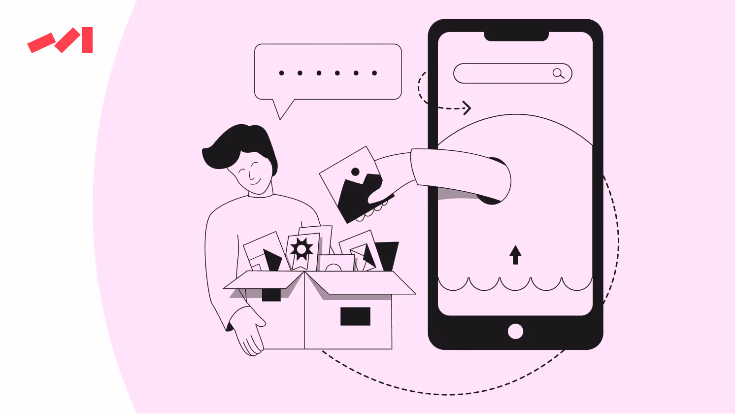
Reduce or eliminate unnecessary content and elements that bog down load times. If an image doesn’t load, it serves users as a reason to abandon the site. So prioritize content that contributes directly to user engagement and conversion, and don’t forget CTAs on your homepage.
Use tools like BrowserStack to see if your site is effectively optimized for various devices.
Quality design is key to effective marketing. It captures attention, increases engagement, and drives conversions.
Before you go, subscribe to our newsletter to learn how strategic design decisions can transform your marketing efforts and help your business stand out.
Don’t miss out on the opportunity to learn more and stay updated on the latest trends!
Book a free 30-minute call with Darwin's Head of Design to brainstorm and fire off questions about the project you're racking your brain about. In this session, you'll gain a design concept idea developed on the spot, providing a solid starting point for your design journey.
Book a Call


.avif)


