.avif)
Learn how to design a high-performing website header. Tips, best practices, and examples to boost UX, SEO, and brand engagement!
Your website’s header is the first thing visitors encounter, and in just 0.05 seconds, they’ve already formed an opinion about your site. A well-designed header not only grabs attention but also builds trust, improves navigation, and ultimately increases engagement on your site.
This guide will walk you through everything you need to know about creating an effective website header—from its essential elements to common mistakes to avoid and future trends you should prepare for.
Take the first step toward a more engaging and professional website. Need more guidance?


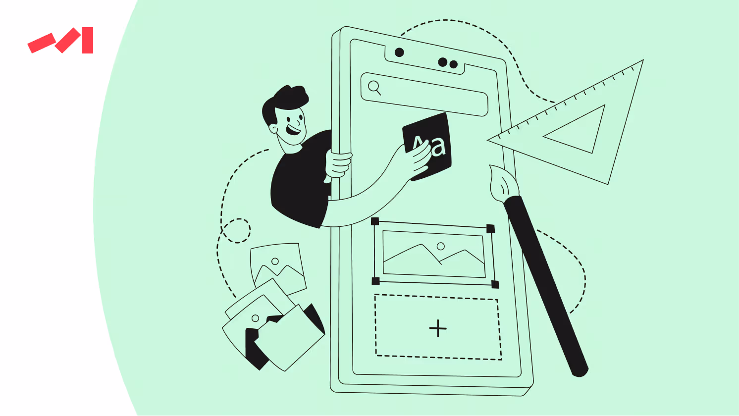
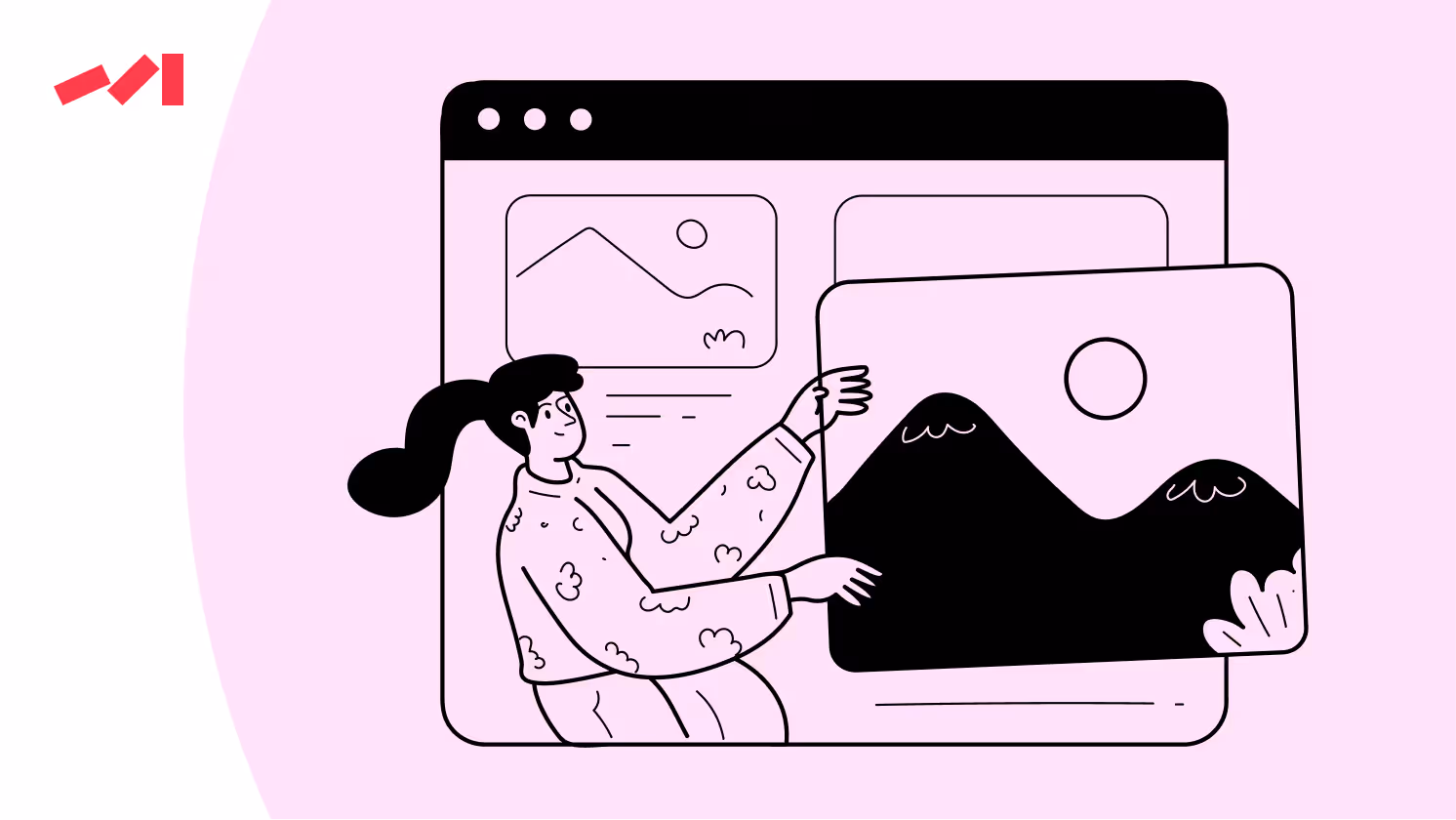
A website header is the top section of your webpage, often containing key branding, navigation, and engagement elements. Think of it as the gateway to your website. It’s the digital equivalent of a storefront sign, drawing visitors in and guiding them to where they need to go. Typically, a header includes your logo, a navigation menu, and sometimes additional features like a search bar, call-to-action buttons, or contact information. Its design and functionality are essential for creating a seamless and user-friendly browsing experience.
Your website header plays a critical role in making a strong first impression. A thoughtfully designed header not only helps users find their way but also ensures a smooth and enjoyable browsing experience. According to UI expert Jenna Roberts, "Designing for 2025 isn’t just about hopping on the latest trends — it’s about creating experiences that truly matters the most."【Muzli, 2025】, and headers should definitely be built to encourage further interaction with your website.
Headers that are clean, intuitive, and easy to navigate can significantly reduce bounce rates while improving user retention and engagement. For example, websites with clearly visible navigation links experience 30% lower bounce rates, according to the Nielsen Norman Group【NNG Report, 2024】. Beyond functionality, your header’s design elements—such as font choice, color scheme, and layout—should reinforce your brand identity, helping visitors associate those visuals with your business.
Start by optimizing your headers to enhance navigation and build a stronger connection with your audience. Need help?
Additionally, a well-crafted header can include features like promotional banners or notifications that highlight key information, such as sales, events, or new content. This makes the header not only a tool for navigation but also a strategic area for driving conversions and highlighting priorities. In short, a great header is a combination of good design, usability, and brand strategy coming together to create a lasting impression.
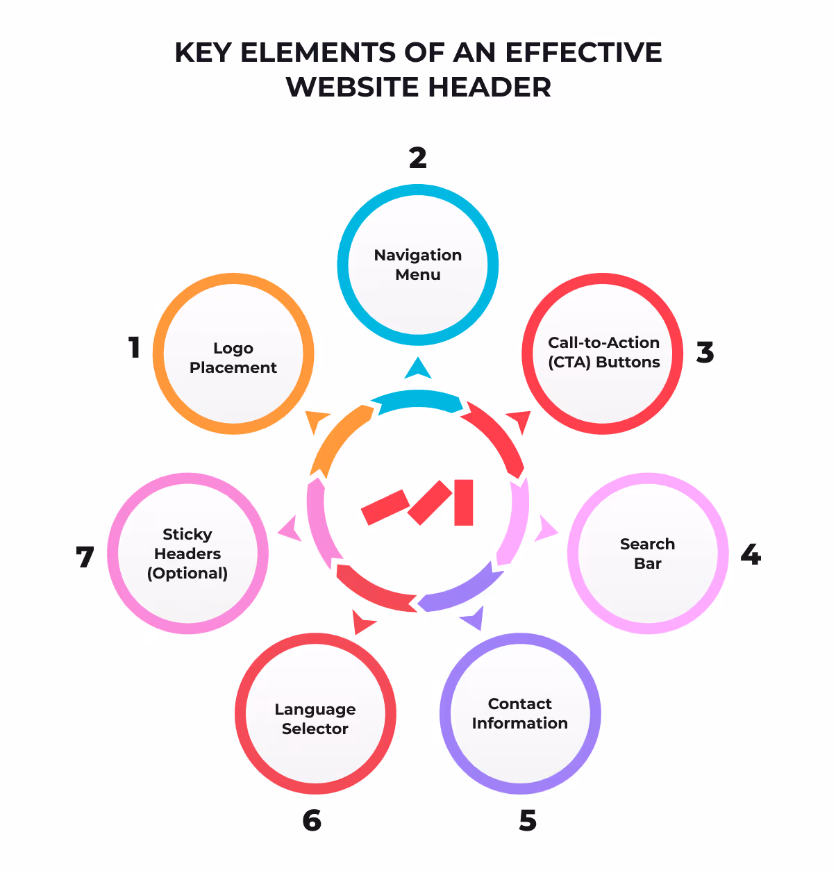
An effective header combines form and function to maximize usability and look amazing, and consists of the following essential components:
Position your logo prominently on the left or center of the header. Ensure it links back to the homepage for easy navigation. Make sure it's clear and crisp and reflects your brand.
A straightforward navigation menu helps users explore your website with ease. Limit it to 5–7 primary options, and consider using dropdown menus for subcategories to avoid clutter.
Include a prominent yet simple CTA, such as “Get Started,” “Book a Demo,” or “Subscribe.” CTAs guide users toward meaningful actions and drive conversions.
A search bar is vital for content-heavy websites. Make it visible and functional to help users find what they need quickly.
If applicable, display contact details like phone numbers or a “Contact Us” button for easy accessibility.
For global audiences, provide a language selector to cater to diverse visitors.
Consider using sticky headers that remain visible while users scroll. However, ensure they don’t take up too much screen space or distract from the content.
To make the most of your website header, follow these tried-and-true guidelines:
Less is more. Avoid overcrowding your header. A simple layout ensures focus on the most important elements.
With mobile traffic surging, your header must adapt seamlessly to smaller screens. Use collapsible menus and responsive designs for a smooth mobile experience.
Vague CTAs like “Click Here” confuse users. Instead, use actionable language like “Sign Up Now” or “Try for Free” to guide them.
Heavy images or animations in the header can slow down load times, frustrating users. Stick to lightweight elements that balance design and performance.
Enhance credibility by including certifications, awards, or customer reviews in the header. This aspect is equally significant as the overall brand image crafted by the brand’s employees and executives.
“writing just a check may not always be enough for consumers, but by having the brand’s executives and employees helping in the community and/or personally supporting a cause, the brand makes a larger impact and a deeper connection with its consumers. 【WWD, 2017】.
Even the best intentions can result in flawed headers. Watch out for these common pitfalls:
Too many navigation items overwhelm visitors. Simplify your options.
Highlight just one or two primary calls to action to avoid confusing users.
Text that blends into the background makes information hard to read. Use high-contrast colors for visibility.
Neglecting mobile responsiveness alienates a growing segment of users.
Failing to refresh your header for seasonal promotions or current branding can make your site feel obsolete.
Real-world examples can spark inspiration. Here are some brands that get it right:
Elegant and minimalist, Apple’s header features an unobtrusive logo and a clean navigation bar.

With a bold CTA (“Start Free Trial”), Shopify’s header is designed to guide users toward the next step.

Airbnb’s header combines intuitive navigation with personalized options based on user preferences.

Brands that frequently A/B test their website headers see up to a 25% improvement in conversion rates【HubSpot , 2025】.
Your website header doesn’t just guide users through your site; it’s also a powerful tool for optimizing your site for SEO and generative search engines. An effective header not only improves user experience but also plays a critical role in how search engines index and rank your content. Here’s how:
A well-designed header grabs attention and encourages users to explore more of your site, increasing the time they spend on it. This also reduces bounce rates, both of which are positive signals that search engines use to evaluate your site’s relevance and quality. The more engaged your visitors are, the better your chances of ranking higher.
Headers that are visually clear, easy to navigate, and semantically structured not only enhance the user experience but also improve your site’s accessibility for all users, including those using assistive technologies. This structure helps search engines crawl and index your content more effectively, boosting your SEO performance.
In the age of generative AI, platforms like Google’s AI Overviews and similar tools rely heavily on structured headers to accurately summarize website content. Clear and descriptive headers make it easier for AI models to interpret your information and provide accurate summaries to users, increasing your visibility in search results.
Content expert Edwin Toonen emphasizes, It increases the chances of people reading your article, improves accessibility, and might even contribute to SEO”【Yoast, 2025】.
Investing in a well-thought-out header design is more than just aesthetics; it’s a strategic move to enhance user experience, improve accessibility, and optimize your site for both traditional and AI-driven search engines.
Stay ahead of the curve by preparing for these innovative trends:
Dynamic headers that adapt to individual users based on their behavior or preferences.
Subtle animations that enhance interactivity without distracting users.
Headers that prioritize inclusive design, ensuring access for all users.
Navigation that responds to voice commands for hands-free browsing.
Your website header is more than just real estate at the top of your page. It’s a cornerstone of your brand’s identity, user experience, and overall website performance. By keeping it clean, functional, and engaging, you can make lasting first impressions and guide users toward meaningful interactions.
Audit your current header design today and explore opportunities for improvement. A crisp, intuitive header could be the key to boosting your engagement and conversion rates.
A logo, navigation menu, clear CTA, search functionality, and optional trust elements like awards.
It’s the first interaction users have online. A great header improves navigation and reduces bounce rates【NNG Report, 2024】.
Sticky headers improve navigation on long pages but should remain slim and unobstructive.
Yes. Poorly designed headers can lead to higher bounce rates, negatively impacting search rankings.