Learn how quick fixes and long-term solutions for design failures, from unclear user scenarios to visual chaos, can boost conversions on your product pages.
Before we dive into why product pages fail to drive sales, let's make it clear that B2B and B2C product pages fail to do so in different ways, even though there.
Yet, at the core of these failures lies poor product design, for which there is absolutely no excuse in these highly online-driven days. No wonder getting UI and UX design right is non-negotiable in such a competitive world of software products or e-commerce.
Even if you have a great solution or product that can solve your users' pain points or satisfy their tastes, poor on-page UX will send users running from your product ᅳ much to your disappointment.
At times, we think we know how to capture the undivided attention of all users as if they all act in the same way. Here's the blow: they don’t.
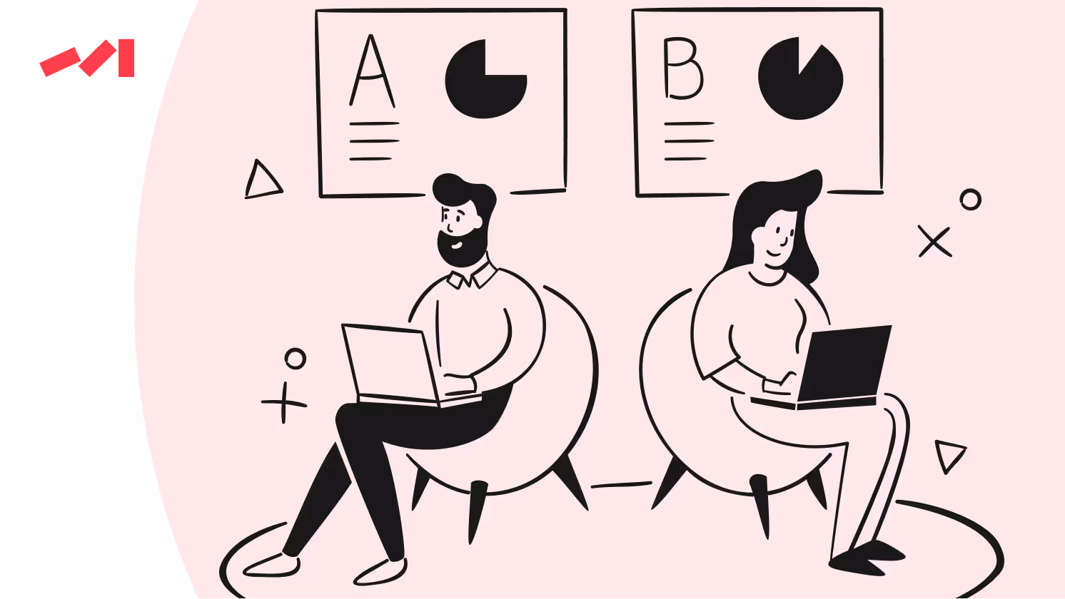
The smart move that helps us understand user behavior is to divide potential customers based on their readiness to make a purchase. Some are at the stage of research, others haven’t yet realized that they have a problem, whereas others compare solutions well aware of what they need, and some need the final push.
The main piece of advice is not to hit extremes: unrealistic scenarios, a plethora of them, or too little. Remember that users don’t wait — they’re always making decisions at any stage of their user flow.
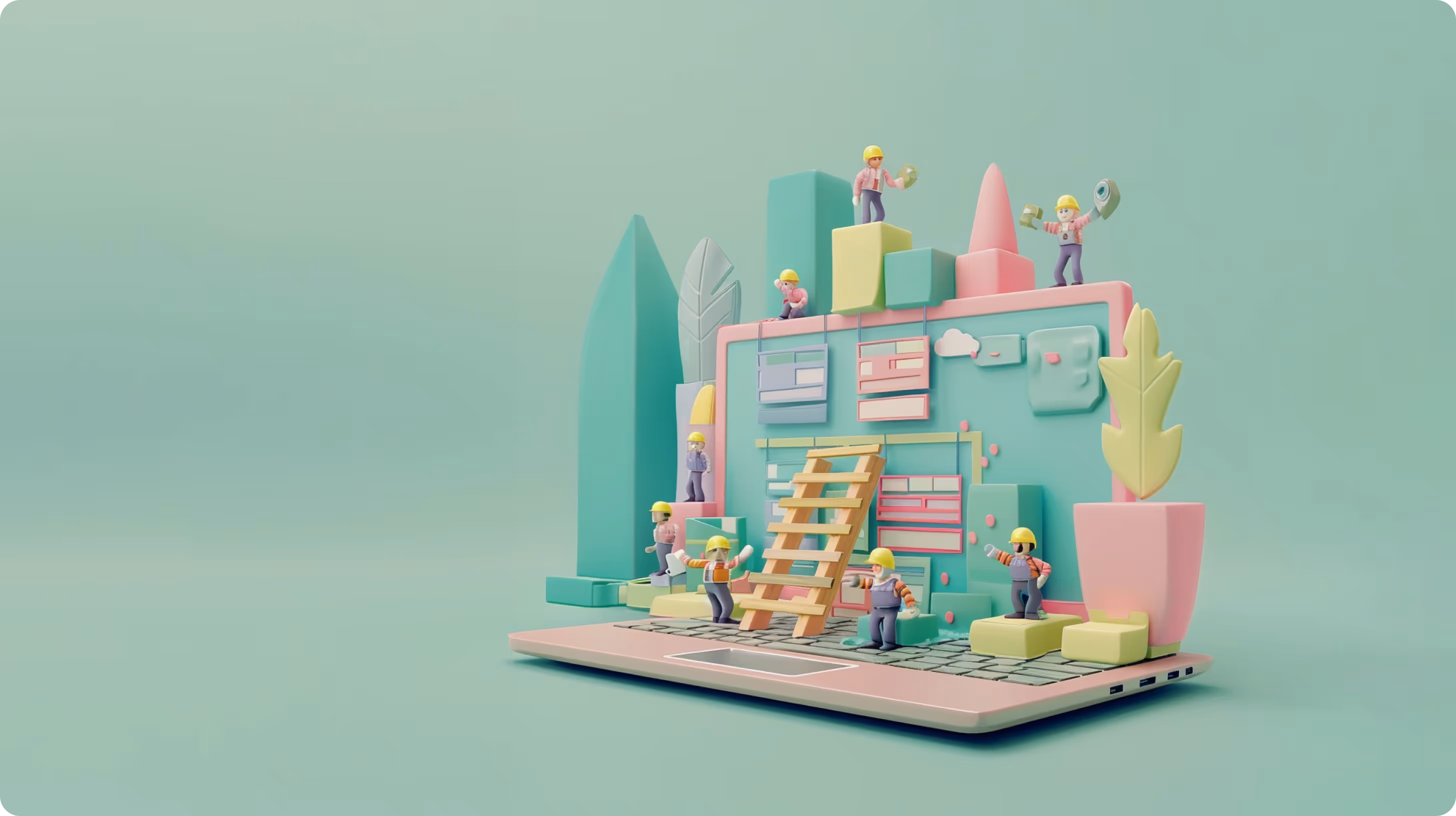
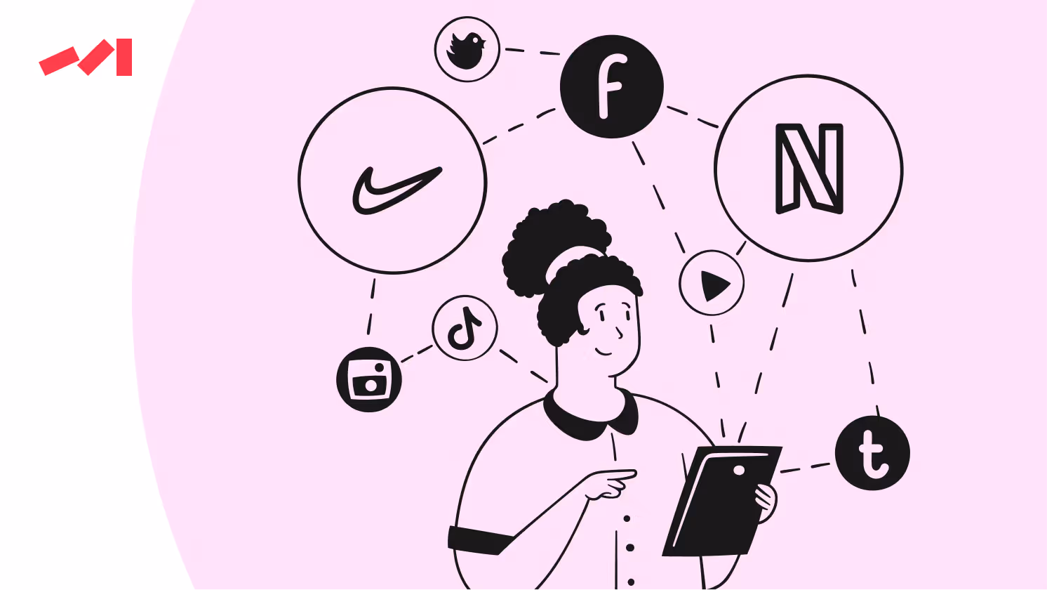
When a product page fails to consider how users interact with it, it’s like a rock that cannot move without external forces. This might manifest as navigation that doesn’t make sense, buttons that are hard to find, or all the widgets — X, Facebook, Pinterest, LinkedIn — do you really need them? Do your customers actually click them? If not, why would you keep them in place rocking the boat?

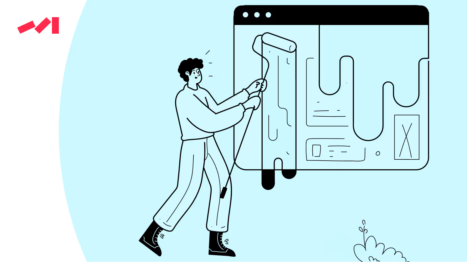
Ideally — and that’s our goal — the user journey on a product page should be a guided, logical path from introduction through evaluation to conversion. If the visual elements on the page, such as images, buttons, text, and colors, are not organized in a way that naturally leads users through this journey, they will be puzzled.
There are some patterns where businesses overdo it with design — overdesigning. These are just a few examples
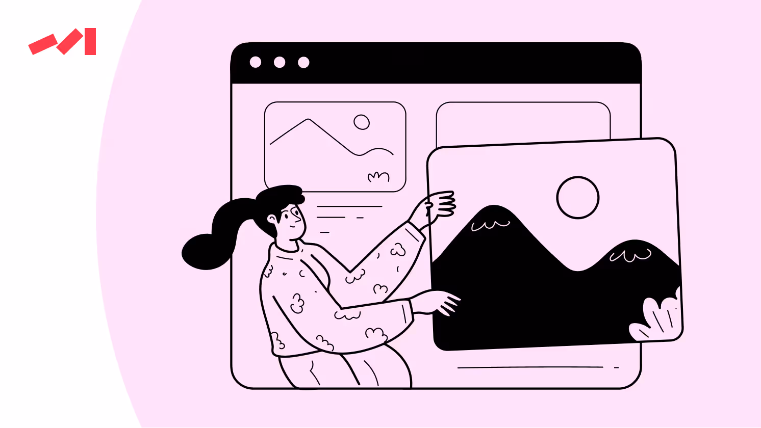
Other points to consider are illegible fonts, inappropriate text sizes, ineffective color contrasts, and unclear imagery. What’s the outcome of it all? Your website has poor visual communication and hierarchy, which nullifies the product's value, consequently turning users away from purchases.
Visual hierarchy is meant to help users navigate easily. The absence of such is meant to make users struggle to find their way through your interface.

To carry out a visual product audit, we gather all elements displayed on the product pages. By all, we mean:
Once garnered in one place comes analysis. With the use of tools like heatmaps, scroll maps, session recording, and hard data collected through analytic tools, we study how users behave and interact with these elements.
Why? By doing so, we uncover patterns, pain points, and on-page areas where users seem baffled or captured. Even though painful, we have to look in the eye of the trouble as well — where users drop off.
The more we know about our users and their on-page behaviors, the more specific we are in mapping out typical user scenarios.
A new visitor exploring a product for the first time, a customer making a repeat purchase, or a user comparing multiple products ᅳ these are the scenarios we must be in control of. If we dive deeper, we'll find that our visual elements are like signposts for users. Our primary task is to identify users' intents to guide them through all the unnecessary information toward the desired destination.

Identify critical touchpoints and prioritize them in the design to navigate users more effectively and intuitively.
You have a sea of insight and data on your users and what doesn’t perform well. So what? If time is of the essence, then act now: simplify navigation, tweak colors to improve button visibility, reduce the content or add more for product description sections, introduce more social proof, or make clear your product's benefits match your customer's needs.
At this stage, perhaps you’re still lacking a coherent visual language across all pages, which is an issue in its own right. How do we guarantee consistency in visual communication? Read further on.
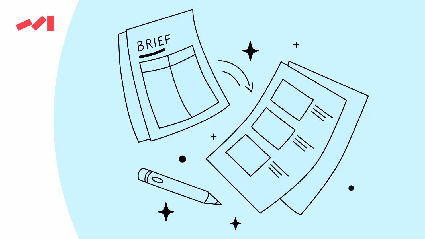
Working out a UI kit or design system is a long-term, future-proof solution. Both include all the visual elements, like colors, fonts, button styles, form elements, and more, to be aligned. In developing a design system, you set up clear guidelines for your in-house designers, vendors, marketing creators, and others to ensure your website has a consistent look and feel.
Flexibility goes a long way. While creating a UI kit, you’d better make it clear that on-page parts and sections can be added, removed, or updated without impacting other elements. This scalability is key for future design changes or additions!
Layouts aren’t just the ways in which we transfer content. They communicate and convey messaging and product value.
Of course, being visually appealing is crucial, but so is effectively communicating the product's value proposition. The visual journey from the product title, its features, benefits, reviews, and calls to action is where you either lose or win your users' hearts.
Want to drive more sales? Then, invest wisely in design to make the most of your website marketing.
Quality design is key to effective marketing. It captures attention, increases engagement, and drives conversions.
Before you go, subscribe to our newsletter to learn how strategic design decisions can transform your marketing efforts and help your business stand out.
Don’t miss out on the opportunity to learn more and stay updated on the latest trends!
Book a free 30-minute call with Darwin's Head of Design to brainstorm and fire off questions about the project you're racking your brain about. In this session, you'll gain a design concept idea developed on the spot, providing a solid starting point for your design journey.
Book a Design Concept Idea Call


.avif)

