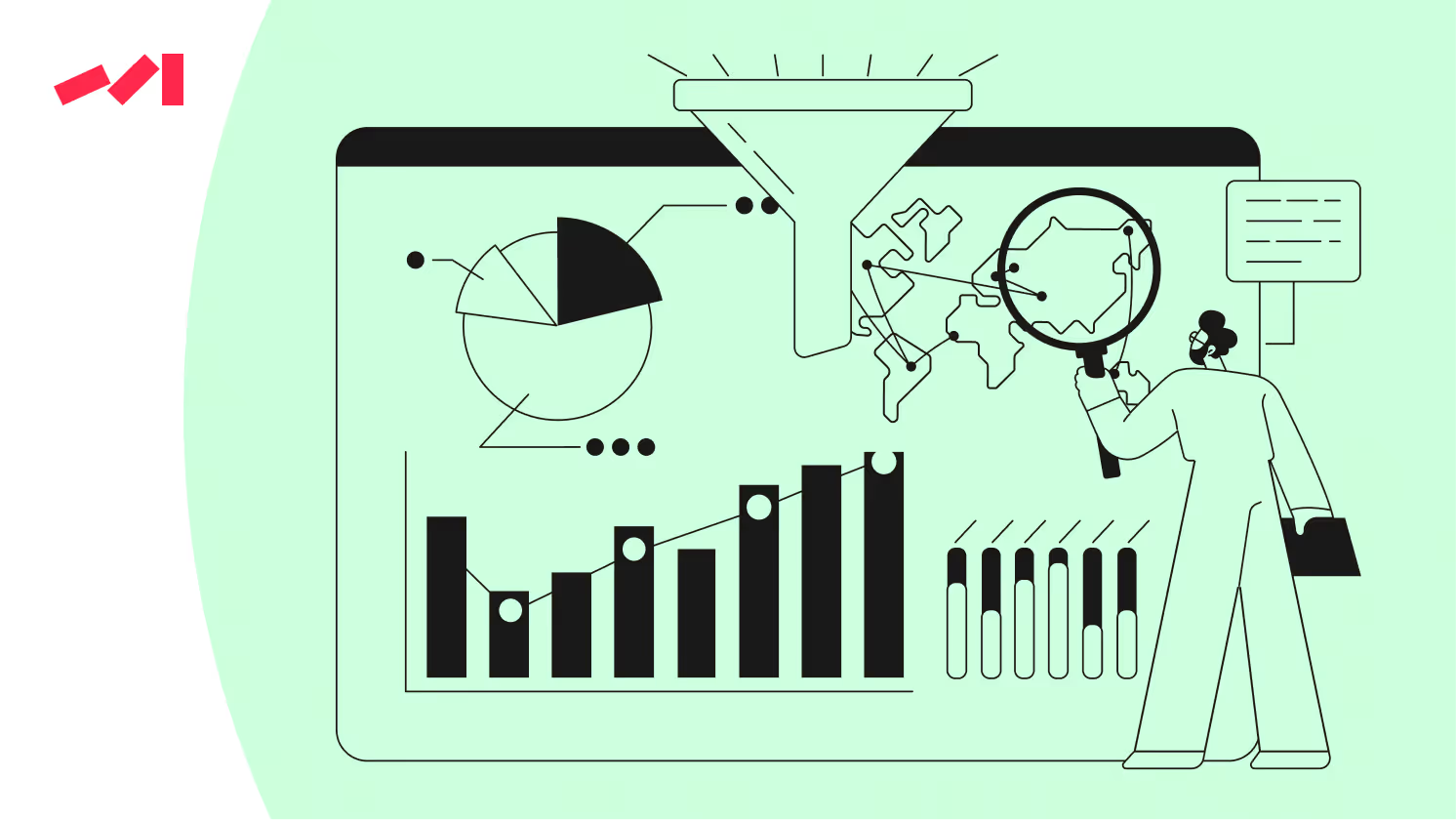
Discover the top 18 tools for interactive analysis and reporting in 2025. Compare features, pricing, and ideal use cases to enhance your business insights.
According to the American Management Association, visualization can shorten business meetings by up to 24%. In today’s data-driven world, businesses are under more pressure than ever to turn raw numbers into clear, compelling visual stories that drive real results. The ability to communicate insights effectively isn’t just a skill—it’s a game-changer for staying competitive.
If you’re a data analyst, business leader, or tech enthusiast, you’ve probably noticed the growing need for tools that make this process easier. The rising demand for AI-powered, intuitive, and interactive data visualization platforms shows just how important it is to present data in ways that are not only understandable but also actionable. These tools empower teams to collaborate better, make smarter decisions, and unlock their full potential.
As we look ahead, the industry is gearing up for a new wave of innovative solutions designed to simplify and enhance how we visualize data. From advanced AI-driven features to customizable open-source platforms, data visualization tools are becoming more adaptable, powerful, and accessible than ever before.
In this guide, we’ve curated a list of the 18 best data visualization tools for 2025, covering everything from enterprise-grade systems for large organizations to budget-friendly options for smaller teams or individuals. Whether you’re seeking a comprehensive platform with advanced analytics or a simple tool to kickstart your visualization journey, this guide has you covered.
Let’s explore how you can choose the right tool to transform your data into meaningful, impactful stories. With the right solution, you’ll be equipped to turn insights into action and inspire growth in your organization.
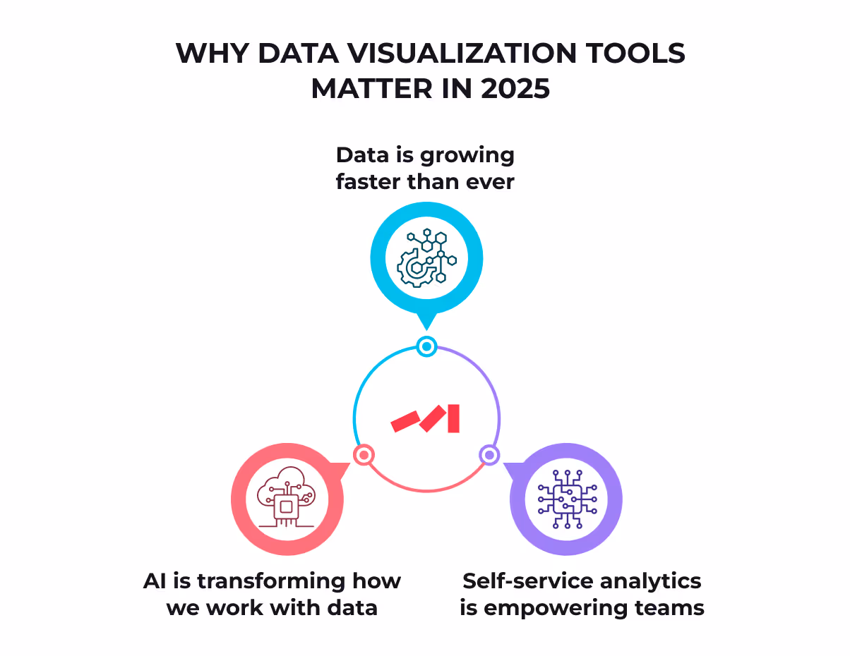
The way organizations operate and make decisions is evolving, driven by the growing need for real-time insights, self-serve analytics, and AI-powered dashboards. In today’s fast-paced business world, actionable insights aren’t just an advantage—they’re essential for staying competitive. Here’s why investing in advanced visualization tools has become a game-changer:
By 2028, global data is projected to hit an astonishing 394 zettabytes (Statista, 2024). That’s massive! To keep up, companies need tools that can process and present real-time data. Imagine having a dashboard that instantly shows you trends, flags risks, and highlights opportunities—helping you act quickly and confidently. Without these tools, staying ahead in today’s data-driven industries is nearly impossible.
Democratizing data access isn’t just a buzzword; it’s the key to unlocking collaboration across every department. When non-technical team members can easily analyze data and create visual insights, silos disappear, and decision-making becomes faster and smarter. Picture your marketing team spotting trends, your ops team optimizing processes, and everyone contributing to the bigger picture with confidence—all thanks to simple, self-serve analytics.
Artificial intelligence is taking the complexity out of data analysis. With AI-generated dashboards, predictive analytics, and natural language tools, creating meaningful visuals has never been easier. These innovations save time, simplify workflows, and make advanced analytics accessible to everyone—not just the data pros.
Embracing real-time insights, user-friendly analytics tools, and AI-driven reporting isn’t just a trend—it’s a key ingredient for long-term success. By adopting these technologies, your organization will be ready to navigate the challenges of big data, make faster decisions, and achieve sustainable growth. The tools are here, and the possibilities are endless. Let’s make it happen!
"Data storytelling can help turn data insights into action," explains Catherine Cote, a marketing coordinator at Harvard Business School Online (Harvard Business School, 2025).
Explore our recommended data visualization tools and find the perfect fit for your team today


Not all visualization tools are created equal. The best ones don’t just tick the basics—they empower you to make smarter, faster, and more confident decisions. Here’s what to look for when choosing top-tier visualization software:
A clean, user-friendly interface makes all the difference. The best tools are easy to navigate, minimizing onboarding time and ensuring anyone on your team—regardless of technical expertise—can dive in and start making an impact.
Your data, your way. Look for tools that let you tailor dashboards and reports to your unique needs. Whether it’s adjusting layouts, colors, or metrics, customization ensures your tool aligns with your goals and priorities.
In a fast-moving world, static data won’t cut it. Tools that offer real-time updates keep your decisions informed and your team ahead of the curve.
Great teams work better when they’re aligned. Visualization tools with collaboration options—like shared dashboards or comment threads—help build transparency and keep everyone working toward the same objectives.
Your data lives in many places, so your tools should play well together. The best software integrates effortlessly with your platforms, databases, and tools, streamlining workflows and simplifying analysis.
Take your insights to the next level with AI-powered features like predictive analytics, natural language processing, or automated recommendations. These advanced capabilities can uncover trends, forecast outcomes, and provide actionable insights to keep you ahead of the game.
By focusing on these features, you’ll find a visualization tool that doesn’t just simplify data—it transforms your team’s ability to collaborate, innovate, and achieve results.
Stat Spotlight: According to the latest Wavestone survey (2025), 87% of teams now use collaborative dashboards to track KPIs and boost performance.
Tableau’s versatility and reliability make it a go-to solution for businesses looking to turn complex data into clear, actionable insights.," notes Gartner’s Magic Quadrant, 2024.
Stat Spotlight: “AI simplifies complex data in seconds, personalizes experiences, and enhances efficiency and productivity”, says Melissa Matias, Data Visualization Expert.
Generative search engines like ChatGPT and Perplexity.ai are transforming how we access information, thanks to advanced data visualization tools. With platforms like Tableau and Looker, they create clear, interactive dashboards and reports designed to be easy for both people and AI systems to understand.
By generating GEO-friendly (Generative Engine Optimization) visualizations, these tools ensure data is structured for better discoverability and usability within AI-driven systems. This means users can access insights faster, while the data remains seamlessly integrated for AI platforms. Together, these tools are paving the way for a smarter, more connected AI ecosystem—making it easier than ever to turn data into action.
Choosing the right tool can be a game-changer in reaching your goals efficiently. To make the best decision, focus on your unique needs, budget, and the features that each option brings to the table.
No matter your situation, there’s a tool out there to help you succeed. Take a moment to assess your priorities, and move forward with confidence knowing that the right solution can empower you to achieve your goals.
Choosing the right visualization software can completely transform your data strategy, empowering you to make smarter, faster decisions with ease. Whether you're a developer, marketer, or part of a growing startup or large enterprise, these tools are designed to meet a wide range of needs and help you succeed.
Looking to use the strength of data insights in 2025?


.avif)