
Discover the top 12 dashboard software tools perfect for data visualization and analytics. Unlock actionable insights and drive success.
Data is the backbone of modern business decisions. FinancesOnline reports that the average individual generates 1.7 MB of data every second.
But analyzing complex datasets doesn’t need to be overwhelming. With the right dashboard visualization tools, you can gather data from disparate data sources, create visualizations, and drive deeper insights with just a few clicks.
If you're wondering where to buy dashboard visualization tools that combine ease of use, scalability, and powerful features, this guide walks you through the 12 best options—each offering something unique for business users looking to transform their analytics workflows.
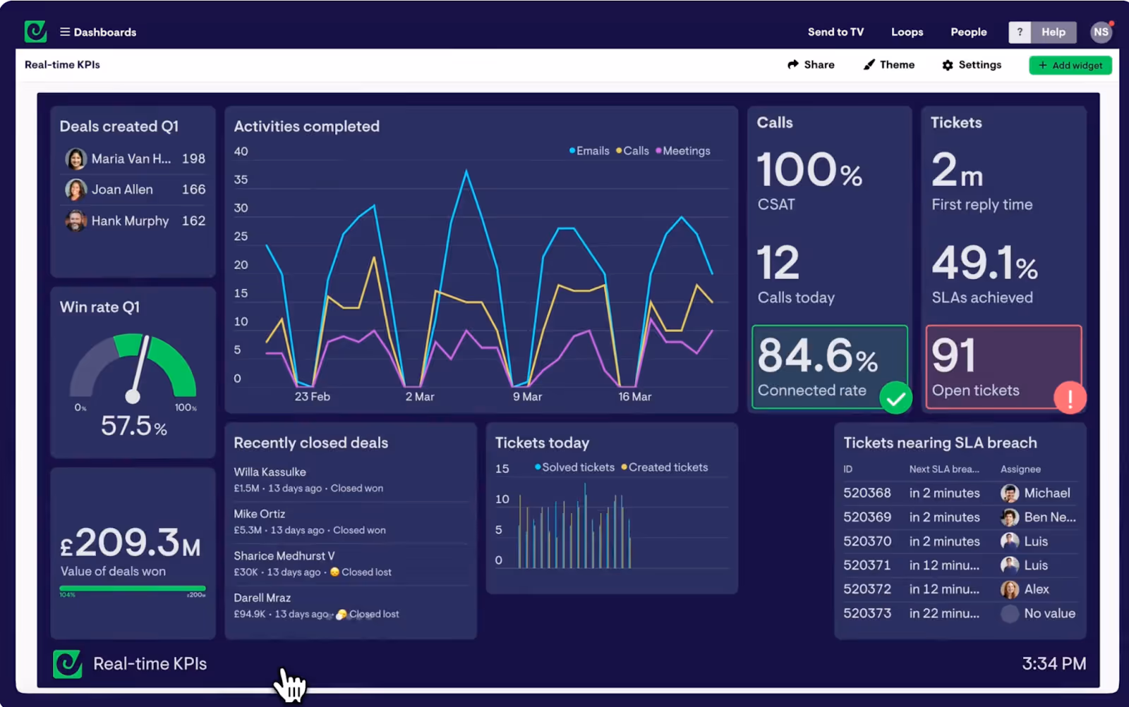
According to the Rochester Review, half of the human brain is dedicated to processing visual information. So how does this resonate with dashboard software? Dashboard software is a category of powerful visualization tools that centralize and visualize information from various systems—turning raw numbers into interactive visualizations. These platforms support everything from web analytics and machine learning models to simple charts and graphs based on CSV files or Salesforce data.
Whether you’re displaying data through area charts, combining static charts with real-time updates, or integrating cloud services, these tools enable users to go from raw data to compelling data stories—without requiring advanced programming knowledge.
"Visual language uses tools such as maps, icons, storyboards, charts and matrices to convey information quickly and effectively. Thus communications translate faster and have a greater impact on bottom-line results," says Marian Bonsignore, president of the People Solutions Group at Proudfoot Consulting
Data preparation is essential for telling a compelling data story. It involves organizing and cleaning your data to ensure accuracy and relevance in your visualizations. Here are some best practices to help you prepare your data:
Before diving into visualization, make sure you have a clear understanding of the dataset. This includes knowing the source of the data, its limitations, and any potential biases.
Eliminate irrelevant data and clean up any inconsistencies or errors. Organize your data in a logical way that will make it easy to analyze.
Not all variables in your dataset will be useful for your analysis. Choose the ones that are most relevant to your goals and discard any unnecessary ones.
Instead of just presenting data, try to create a story with it. This will help engage your audience and make the insights more memorable.
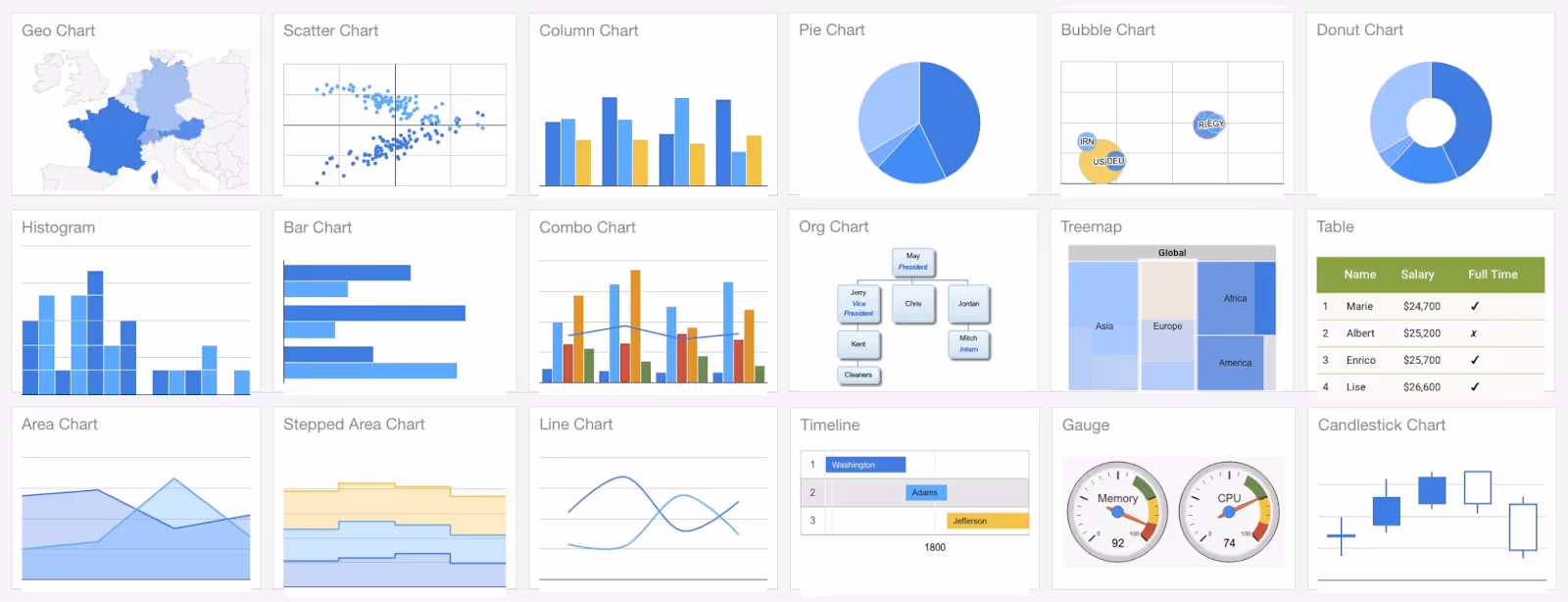
Use appropriate charts and graphs that effectively convey the message you want to communicate. Avoid cluttered or confusing visualizations.
Involve other team members in the data analysis process and communicate your findings clearly. This can lead to new insights and better decision-making.
Data is constantly changing, so it's important to continuously refine and update your visualizations as needed.
A survey titled Defining Digital Experience by Content Square reveals that 52% of brands have teams specifically focused on digital analytics and insights, while 44% have a dedicated data science team.
When deciding where to buy dashboard visualization tools, keep these criteria in mind:
Looking to take your data insights to the next level?
Schedule a free consultation today and see how Darwin can help.


Known for its powerful features and stunning dashboard visualization, Tableau is ideal for businesses focused on creating dashboards that drive impact. Its native Salesforce data integration makes it a top pick.
Ideal for: Enterprise teams, advanced analysts
Notable features: AI-driven analytics, strong mapping capabilities

Grafana excels at customization options and real-time monitoring, offering open-source flexibility and integration with hundreds of other tools.
Ideal for: Engineering and DevOps teams
Bonus: Strong support for machine learning monitoring dashboards

This user-friendly interface allows teams to build interactive visualizations and automate reporting, especially across Google Ads, Sheets, and BigQuery.
Ideal for: Marketers and analysts in need of seamless data import options

Power BI supports business users with easy-to-use features, drag-and-drop components, and excellent compatibility with CSV files and Microsoft products.
Ideal for: SMBs with growing analytics needs
Value: Delivers cost savings without sacrificing power
Unlock the power of your data with tools designed to simplify, scale, and elevate your decision-making processes.

With built-in connectors to dozens of business applications, Klipfolio is ideal for businesses working with disparate data sources.
Ideal for: Digital agencies and startup teams
Strength: Strong self-service analytics options
Geckoboard simplifies dashboard visualization by making it easy to share results on Slack, emails, or public screens.
Ideal for: Sales teams, support departments
Strength: Easy to use with limited programming knowledge required

Databox supports mobile-friendly dashboards and real-time alerts, making creating dashboards on-the-go incredibly easy.
Ideal for: Executives and marketers
Strength: Visual storytelling with live charts and graphs

Qlik enables teams to gather data, discover hidden insights, and even explore machine learning-driven predictions within dashboards.
Ideal for: Mid-to-large enterprises
Strength: Flexible for teams with both BI and dev skillsets

Metabase requires no coding knowledge, which makes it perfect for business users who want to dive into reports quickly and visually.
Ideal for: Small teams or departments
Bonus: Available as a free desktop app

Built for cloud services scalability, QuickSight supports large-scale data visualization tools for AWS-first companies.
Ideal for: Enterprises using AWS infrastructure
If you just need lightweight dashboards to display data and embed charts into websites, Google Charts offers a fast, free option.
Ideal for: Developers and educators
Limitation: Not suitable for high-volume data points
Zoho offers end-to-end dashboard visualization tools, report templates, and robust support for business applications.
Ideal for: SMBs already using the Zoho suite
Bonus: Offers predictive analytics and embedded BI
If you're wondering where to buy dashboard visualization tools that meet your unique business needs, this list is a great starting point. From data visualization tools with drag-and-drop simplicity to enterprise-grade analytics with powerful features, each solution here offers distinct value.
Whether you prioritize customization options, cloud services, or user-friendly interfaces, don’t hesitate to explore free trials and compare platforms based on your important metrics. Modern teams demand flexible solutions that enable self-service analytics, unify disparate data sources, and generate actionable data stories—without writing a single line of code.
Dashboard visualization tools are software platforms that allow users to gather data from various sources, create visualizations like charts and graphs, and display them in interactive dashboards. These tools help businesses analyze complex data and make data-driven decisions.
You can purchase dashboard visualization tools from official vendor websites, software marketplaces, or authorized resellers. Many tools also offer free versions or trials directly on their websites, such as Tableau, Microsoft Power BI, and Google Looker Studio.
Yes, several dashboard visualization tools offer free versions or free trials. Examples include Google Charts, Google Looker Studio, Tableau Public, and Metabase desktop app, which provide powerful features suitable for beginners and small teams.
For beginners, tools with an intuitive user interface and drag-and-drop functionality, like Google Looker Studio, Microsoft Power BI, and Klipfolio, are ideal. They require little to no coding knowledge and offer extensive tutorials and support.
Many modern dashboard visualization tools support real-time data and real-time analytics, enabling businesses to monitor key metrics as they happen. Examples include Grafana, Databox, and Microsoft Power BI.
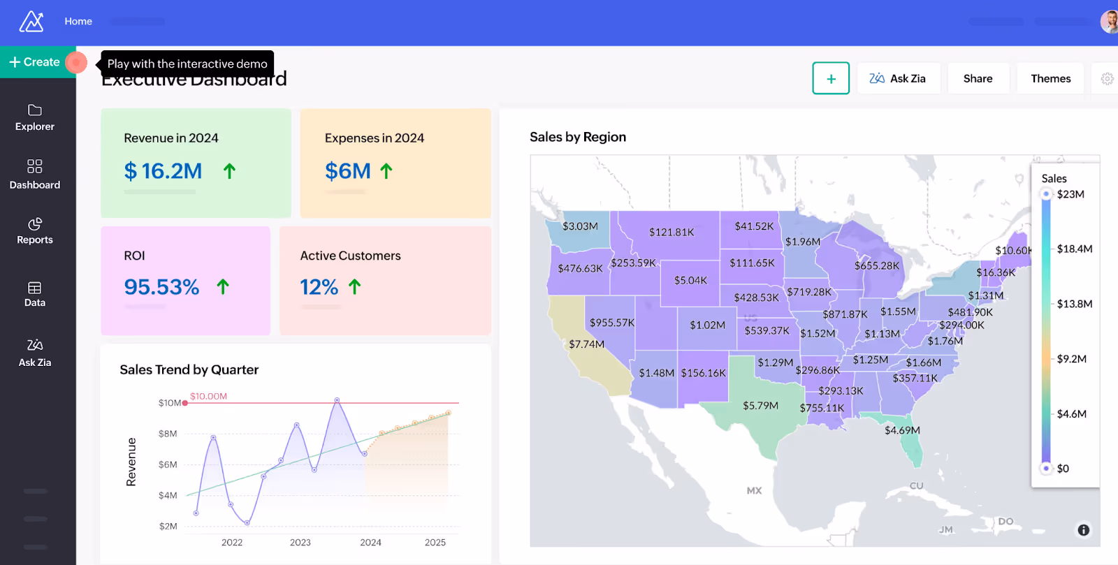
By providing customizable dashboards with multiple chart formats and interactive graphs, these tools enable teams to visualize all the data in an accessible way. This fosters better data storytelling, supports data-driven decision making, and streamlines business operations.
Most dashboard tools offer extensive data import options, including connections to cloud services, Excel files, Salesforce data, Google Sheets, and more. This allows seamless integration with existing business applications and data sources.
Yes, many dashboard visualization tools allow you to create interactive dashboards and reports that users can explore and customize, enhancing collaboration and insight discovery across teams.
Yes, top dashboard visualization tools provide scalable solutions that can handle millions of data points and grow with your organization's analytics needs.
Consider factors such as integration capabilities, ease of use, customization options, support resources, scalability, and p


