A great-looking KPI dashboard is useless if it doesn’t drive decisions. Learn how to build a performance dashboard that converts raw data into actionable
Most executives don't feel comfortable working with business data. Two-thirds admit this openly, while more than 70% believe data skills are nowhere near easy to master. Numbers are everywhere, yet we can't seem to extract meaningful insights that help make decisions.
A well-laid-out KPI dashboard solves this problem. Companies that use performance strategies with KPIs see better growth, bigger market share, and keep their employees longer. Research from the KPI Institute shows 68% of organizations reported positive improvements in business performance after they started tracking KPIs properly.
This piece will show you how to build KPI dashboards that deliver results. You'll learn to pick the right metrics and avoid mistakes that make most dashboards worthless.
Struggling with dashboards that look good but don’t drive real decisions?
Talk to Darwin about building a KPI dashboard that connects strategy with action.


Picture yourself walking into your business control room and seeing all your critical metrics displayed on one screen. A key performance indicators dashboard does exactly that for your business.
“Dashboards should answer questions, not just display data. The best ones act like decision co-pilots.”— Mico Yuk, BI Evangelist & Founder of BI Brainz
A KPI dashboard transforms complex data into an easy-to-understand format using charts, graphs, and tables. Your organization's most critical performance metrics appear in one centralized location. You can think of it as your business command center where you spot everything important quickly.
KPI dashboards serve a clear purpose, unlike static spreadsheets filled with numbers. They help you monitor performance, spot trends, and make informed decisions fast. The data comes from various sources and appears through interactive visualizations that update live.
Dashboards and reports serve different functions in your business intelligence toolkit, though people mix them up often. The right tool choice depends on your specific needs.
Dashboards monitor day-to-day performance and provide quick insights. They stay interactive, focus on visuals, and update continuously with fresh data. Dashboards become your go-to solution when you need to know your business's current status.
Reports compile and analyze performance data over specific periods in more detail. They provide complete reviews of past performance in a relatively static format. The focus stays on historical data with thorough analysis and recommendations.
“Limit your KPIs. Clarity beats quantity. A dashboard should help people act, not guess.” — Bernard Marr, Author, Data Strategy
Live data updates have changed how businesses operate completely. Your KPI dashboard refreshes automatically with current information and gives you several powerful advantages.
You can spot issues early before they become crises. These dashboards work like early warning systems. They flag potential problems by showing data changes that might spell trouble. A sudden drop in regional sales might reveal a competitor's new marketing campaign, letting you develop counter-strategies quickly.
On top of that, it speeds up decision-making substantially. You can make informed choices based on current data instead of waiting for month-end reports. Marketing teams track campaign performance metrics like click-through rates and adjust their strategies during active campaigns.
KPI dashboards boost departmental communication too. The core team's functional lines merge across the business and create a company that lines up well. Cooperation becomes the focus of data management. Silos disappear and accountability increases when everyone works from the same data.
Time and money savings stand out as the biggest benefits. Modern dashboards automate data collection and visualization and reduce manual reporting effort while minimizing human error. Your team can focus on analysis and action rather than managing spreadsheets.
The right dashboard should give you instant performance visibility, aligned decision-making, faster reaction times, and less reporting work. Your data transforms into decisions that drive business success.
“Real-time updates turn dashboards into operational control centers. It’s the difference between managing and guessing.” — Tamara Dull, Thought Leader in Data Governance

A KPI dashboard isn't rocket science, but you need a well-laid-out approach. You want something that drives decisions rather than collecting digital dust. Here's how to design a dashboard that works.
Clear objectives should come first. Your dashboard needs to show what your organization wants to achieve, not just the easy-to-measure stuff. Start by identifying your strategic goals and the outcomes you want to track.
What does success look like for your company? A dashboard without purpose will become cluttered and useless. Talk to stakeholders from different departments to make sure your dashboard tackles business problems from all angles.
This stage helps you decide if you need an operational dashboard for daily monitoring, a strategic dashboard for long-term goals, or an analytical dashboard to explore data deeply. Each type serves different purposes and audiences.
After you've set your goals, pick KPIs that line up with those objectives. Revenue growth might need average order value (AOV) tracking. Marketing efficiency improvements could need customer acquisition cost (CAC).
Stick to the most significant metrics for your activity. Don't fall into the trap of tracking everything. Most experts say you should limit your dashboard to 5-10 key metrics to avoid information overload. A sales pipeline dashboard doesn't need customer lifetime value or CPA metrics.
The MAD framework might help - it uses three levels: monitor level for high-level KPIs, analysis level for cross-department analysis, and drill level for detailed exploration.
Your dashboard will only be as good as its data. Review all available data sources and pick the relevant ones. List out the systems, databases, and tools that hold data for your chosen KPIs.
Each new source brings engineering and maintenance challenges. You'll connect each to your dashboarding tool, pull appropriate data, transform it, and create proper visualizations. Data quality needs verification through validation checks, data profiling, cleansing, and sampling.
Marketing dashboards giving you trouble?
Darwin can help with guidance and custom solutions when you're stuck on data source selection or integration methods.
The right software can make your dashboard project succeed. Look for platforms with:
Price, deployment time, self-service capabilities, and publishing options matter. Your choice should let you design flexibly and scale up later.
Data presentation matters as much as the metrics. Create a user-friendly layout that puts your most important KPIs first. Put critical metrics in the top-left where users look first.
These visualizations work best for different data types:
A clean, uncluttered design works best. Use whitespace and avoid overcrowding your screen. Use colors sparingly - think traffic lights for easy understanding.
Get feedback from end-users before you roll out your dashboard company-wide. Their experience will point out issues, confusion spots, and ways to improve.
Give dashboard access to everyone who needs it, with proper permissions. You might want to offer training sessions or guides if people need help with the interface.
Set up regular reviews. Experts suggest looking at your dashboard every 12 months to improve metrics and visualizations. This ongoing process will keep your dashboard valuable as business needs change.
Your data deserves better than static reports.
Partner with Darwin to create a KPI dashboard that integrates your data stack and gives every department clear visibility into performance.
Each dashboard serves a unique purpose. You need to know which type fits your needs before building your key performance indicators dashboard.
Strategic dashboards give executives and senior leaders a complete view of their business. They track long-term objectives and company health, which helps C-suite executives make better decisions about their organization's direction.
These dashboards work like your company's compass. Updates happen less often since they monitor performance over longer periods—weekly, monthly, or quarterly. Leaders can see high-level metrics like revenue growth, market share, profitability, and churn rates.
Executives check their strategic dashboard weekly. This helps them monitor ongoing projects and ensures every initiative matches the company's goals. The simple, high-level view works perfectly for stakeholders who want to understand performance without getting lost in details.
Think of your operational dashboard as a spacecraft's control panel—it shows what's happening right now. Teams use these dashboards to watch daily activities and real-time performance. Team leaders and operations managers rely on them for quick decisions.
Unlike strategic dashboards, these update constantly—sometimes every minute. Teams can see metrics like order fulfillment rates, system uptime, ticket resolution times, and other indicators that show immediate performance.
Frontline workers use operational dashboards to catch issues early. A customer support team might watch their average response time and satisfaction scores in real time. This lets them adjust quickly if numbers start dropping.
Want to dive deep into your data? Analytical dashboards let you do exactly that. You can analyze huge amounts of data, spot trends, predict outcomes, and find connections between different metrics.
Data analysts, marketers, and data scientists use these dashboards most. They come with advanced visualizations and tools to learn about complex data sets. Users get more filters, views, and analytical tools than other dashboard types.
These dashboards help teams understand past performance data and uncover hidden patterns. Need help with marketing dashboards? Darwin offers guidance and custom solutions to help you extract valuable insights from complex marketing data.
Tactical dashboards connect long-term strategy with daily operations. Mid-level managers use them to track team performance and project execution through short-term projects and department goals.
Middle management relies on these dashboards to watch success metrics and improve processes. Marketing teams might track lead generation and social media engagement for specific campaigns.
These dashboards stand out because they focus on specific projects rather than overall company performance or minute-by-minute operations. Teams can see metrics like project progress, budget usage, and team output.
Each department in your organization views the world differently. Your sales team cares about numbers that differ from what finance tracks. Dashboards can adapt to meet each department's specific requirements.
Sales teams need clear visibility into their performance. A thoughtful sales dashboard blends executive-level metrics with detailed data for representatives. Chief revenue officers rely on a "State of the Union" dashboard that shows yearly performance against targets and highlights notable deals with top performers.
Pipeline dashboards help sales managers track each rep's progress with average sales cycles and conversion rates. Team activities dashboards display completed tasks, call logs, and AI-generated conversation summaries that reveal customer sentiment.
Sales dashboards excel at motivating teams through visual elements. Companies add leaderboards to promote healthy competition while tracking quotas, leads, closed deals, and average cycle times. These dashboards act as accountability tools for sales reps and show everyone what works and what needs improvement.
Marketing teams have rapidly adopted dashboards because digital channels generate massive amounts of data. A complete marketing dashboard tracks campaign performance on multiple platforms while measuring key metrics like cost per lead, return on ad spend, and conversion rates.
Content teams need dedicated sections for email and blog performance that show open rates, click-throughs, and content pieces' engagement levels. Marketing's best dashboards link activities directly to revenue generation and demonstrate the department's value.
Specialized dashboard versions now exist for SEO, web analytics, content marketing, social media, and pipeline visualization. Marketing teams can optimize their strategies immediately instead of waiting for monthly reports.
CFOs and finance executives use financial dashboards to access vital data about their company's fiscal health. These dashboards display priority metrics like revenue growth rate, gross profit margin, operating cash flow, and EBITDA.
Finance leaders rely on dashboards that combine operational metrics with financial efficiency indicators. Cash conversion cycle and working capital appear alongside return on equity and days sales outstanding. This helps them spot risks early and make decisions about expansions, acquisitions, or cost reductions.
Financial dashboards turn complex data into clear visuals that instantly reveal an organization's financial status. Leaders can make faster, data-driven decisions with confidence.
Operations dashboards serve as early warning systems for daily business functions. Teams monitor vital operational KPIs including overdue work orders, preventive maintenance performance, and asset health.
Trend information shows metric changes since the last update and distance from organizational targets. Quick action cards and work queues help teams focus on their priorities.
Operations managers use these dashboards to measure efficiency, effectiveness, and quality that affect customer satisfaction and costs. Small issues get caught before becoming major problems.
Executive dashboards offer an integrated view across major functions and connect strategic goals with operational results. Leaders see KPIs from every department without getting lost in details.
CEO dashboards typically show finance metrics, sales data, marketing performance, support metrics, and development indicators. This includes gross profit margin, EBITDA, revenue, pipeline opportunities, MQLs, web sessions, ticket volume, resolution time, lead time, and cycle time.
Strategic KPIs dominate the best executive dashboards and provide a comprehensive view of organizational performance. These tools balance leading indicators with lagging ones to give leaders both historical perspective and future insights.
A dashboard might look stunning, but it's just digital art if nobody uses it. The best KPI dashboards combine appealing visuals with practical decision-making tools that follow proven design principles.
Your dashboard must reflect its core purpose. The "why" comes first – whether it's for high-level decisions or daily operations tracking. Understanding your audience makes a difference. Executives need quick visual summaries. Analysts require more filters and context. The most critical KPIs belong in the top-left corner where eyes naturally land first. Each element should serve a clear purpose instead of just occupying space.
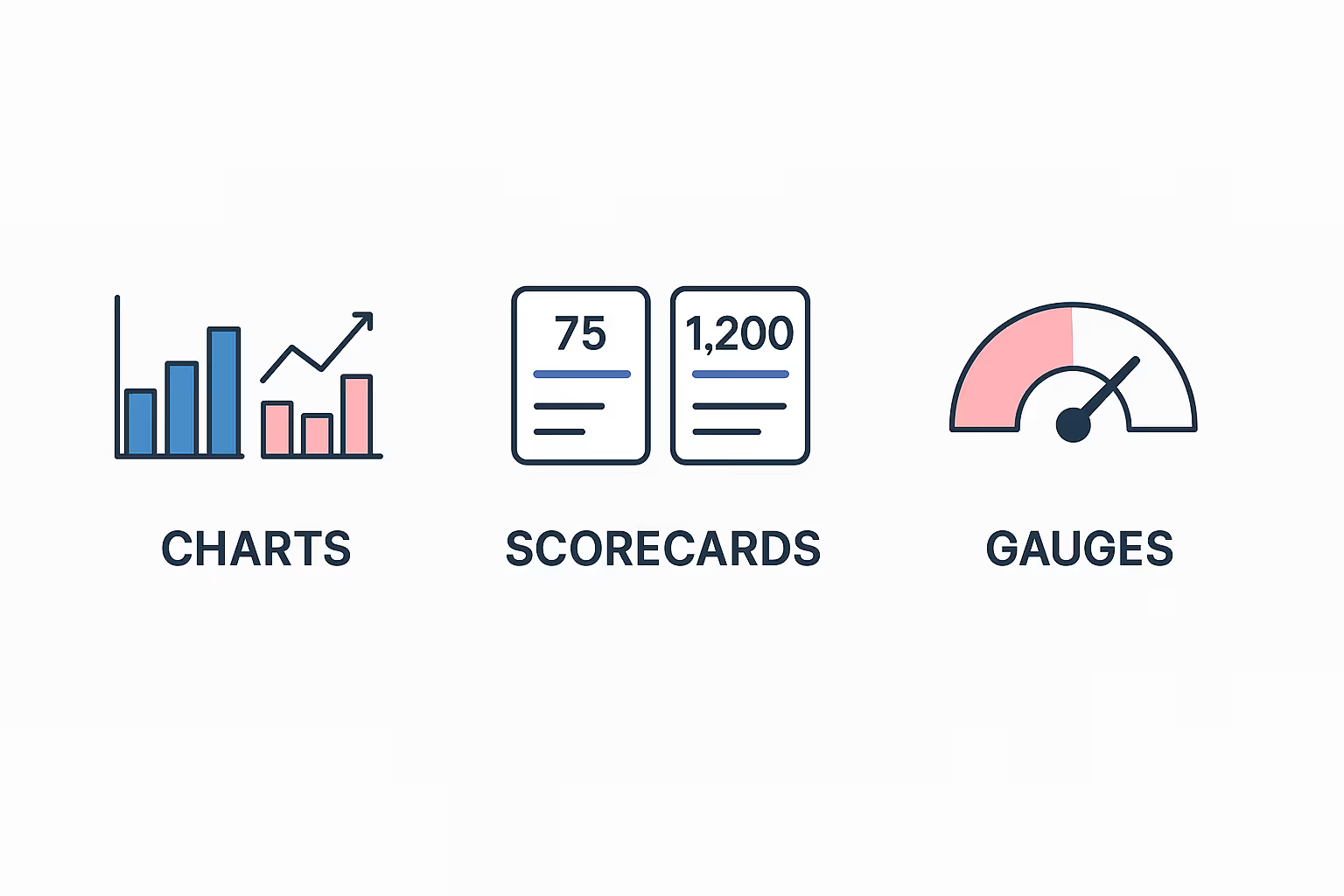
Each metric needs its own visual treatment. The right visualization tells your data's story effectively:
The data-ink ratio matters – it shows how much ink presents relevant data versus decorative elements. Clarity beats fancy 3D effects every time.
Dashboard design works best with fewer elements. A focused set of 5-10 metrics that matter makes the biggest difference. Fewer KPIs lead to clearer communication and simpler reports. The team understands their responsibilities better, which promotes personal investment. Quality beats quantity – each KPI should spark specific action.
Business professionals check their data on phones daily - about 70% of them. Mobile devices now account for 62% of global website traffic. Your dashboards should adjust automatically to fit any screen. Mobile displays need higher contrast - darker backgrounds with lighter elements help KPIs and outliers pop on smaller screens.
Manual reporting creates errors and wastes valuable time. Modern dashboards should update live or on schedule without human input. Teams trust automated updates because the data stays current. ETL (Extract, Transform, Load) processes cut down human error – no more misplaced rows or formula mistakes. This lets analysts focus on strategy and interpretation rather than maintaining spreadsheets.
Beautiful dashboards can fail big time when they fall into these common traps.
Information overload is real. Most dashboards show too much data at once, and nobody can make sense of it. Your useful insights get buried in the noise when you try to make everything a KPI. The best approach is to pick a few metrics that line up with your business goals. Teams can avoid analysis paralysis and find critical insights faster with a dashboard that shows fewer KPIs.
Vanity metrics make you feel great but don't help with better decisions. These empty numbers might look good without adding value - like page views without conversion rates or social media followers without engagement. The biggest problem? They have no context, unclear purpose, and don't lead to action. Darwin can help you tell useful metrics from vanity ones if you're stuck with marketing dashboards.
Data becomes useless without context. Your dashboard data needs goals and targets to show real progress. Industry measures alone won't work because they don't consider your business's unique strengths and weaknesses. A good dashboard should tell your business's story and guide what you do next.
Bad data can ruin a dashboard faster than anything else. The quality suffers from poor source data, delayed ETL pipelines, and bad transformations. Note that garbage in means garbage out. Your visualizations won't matter if your data isn't clean and accurate. Quality stays high when you set up data governance processes and control plans.
Dashboards often sit there gathering dust. Some treat KPIs like family heirlooms that nobody should touch or adjust. Your KPIs need to change as business evolves and markets shift. Look at your dashboard at least once a year to keep it relevant as your organization grows.
A successful KPI dashboard goes beyond attractive charts and graphs. It transforms your business data into practical insights that shape decisions. The right dashboard can convert overwhelming metrics into clear, focused information that helps teams achieve their goals.
Evidence shows that companies using proper KPI tracking perform better than those without it. Creating an effective dashboard demands careful planning, but the benefits justify the effort. Better decision-making, enhanced performance, and time savings make it a worthwhile investment.
Q1. What is a KPI dashboard and why is it important? A KPI dashboard is a visual interface that displays an organization's most critical performance metrics in one centralized location. It's important because it helps monitor performance, identify trends, and make informed decisions quickly by transforming complex data into an easy-to-understand format.
Q2. How many KPIs should be included in a dashboard? Most experts recommend limiting your dashboard to 5-10 key metrics to prevent information overload. This focused approach ensures that you're tracking only the most crucial metrics for your monitored activity, making it easier to extract meaningful insights and take action.
Q3. What are the different types of KPI dashboards? There are four main types of KPI dashboards: strategic dashboards for long-term objectives, operational dashboards for daily monitoring, analytical dashboards for deep data exploration, and tactical dashboards for short-term projects and departmental goals. Each serves different purposes and audiences within an organization.
Q4. How often should KPI dashboards be updated? KPI dashboards should ideally update in real-time or on a fixed schedule without human intervention. This ensures that your team always has access to current data. Additionally, it's recommended to review and potentially revise your dashboard's metrics and design at least annually to ensure it remains relevant as your organization's needs evolve.
Q5. What are some common mistakes to avoid when creating a KPI dashboard? Common mistakes include tracking too many metrics, using vanity metrics that look impressive but don't guide action, lacking context or benchmarks for the data, relying on poor quality data, and failing to update dashboards regularly. Avoiding these pitfalls will help ensure your dashboard remains an effective tool for decision-making.
Contact Darwin to design a custom KPI dashboard that aligns with your goals, integrates your data stack, and turns insights into impact.
Contact Darwin


.avif)