.avif)
Struggling with slow Tableau dashboards? Discover 8 proven techniques to boost speed, cut load times, and impress stakeholders in 2025 and beyond.
Your Tableau dashboard is taking forever to load, isn't it? Two seconds. That's all the time you have before your audience starts getting restless. Any longer and they're already clicking away or checking their phones.
We see this exact scenario play out constantly. You've spent days crafting the perfect data visualization, only to watch it crawl along when you try to demo it to stakeholders. Sure, the typical Tableau extract can handle between 500 million to a billion rows of data, but that doesn't mean your dashboard will run smoothly without some serious optimization work.
Here's the thing: dashboard performance optimization isn't just about technical specs—it's about user experience. The payoff can be huge. Proper tuning can transform a dashboard that takes a full minute to load into one that responds in under 5 seconds. That's the difference between an awkward silence and an impressed audience.
The good news? You don't need to be a technical wizard to speed things up. Sometimes it's as simple as removing unnecessary information to improve loading times or being smarter about how you use filters. Excessive filters create more complex queries that take longer to process, while extract filters reduce the amount of data Tableau needs to handle right from the start.
Even the number of visualizations matters more than you think. Every viz you add increases the queries Tableau must execute. If you have more than 5 visualizations on a single dashboard, it might be time to consider breaking things up.
Want to know the 8 proven techniques that will dramatically improve your Tableau dashboard performance? This guide will show you exactly how to implement them. Let’s go!
"The cleaner your data is and the better it matches the structure of your questions, the faster your workbooks will run and the happier your life will be." — Tableau Documentation Team, Official Tableau Product Documentation Authors
The foundation of a lightning-fast Tableau dashboard isn't fancy charts or complex calculations—it's clean, well-structured data. Most performance issues start at the data source level. Think about it: regardless of how elegantly you design your visualization, if Tableau has to process millions of unnecessary rows or dozens of unused columns, your dashboard will crawl.
Still manually sifting through bloated data sources?
Let Darwin help you trim the fat and turbocharge your dashboards.


Data curation includes how an organization captures, cleans, defines, and aligns disparate data. It's not just about organization—it's about creating a bridge between raw data and its real-world applications. Organizations are already investing millions in technologies that integrate data definitions with analytical tools, and for good reason.
Clean data matches the structure of your questions, making workbooks run faster. Curated data means Tableau processes only what's relevant to your analysis. Consider this: working with millions of rows or complex joins puts significant strain on processing resources. Poor data management directly impacts both efficiency and decision-making processes.
The benefits are clear—a well-optimized Tableau report provides quick insights, enabling real-time decision-making. Delays in loading dashboards disrupt workflow productivity and frustrate users who need immediate insights.
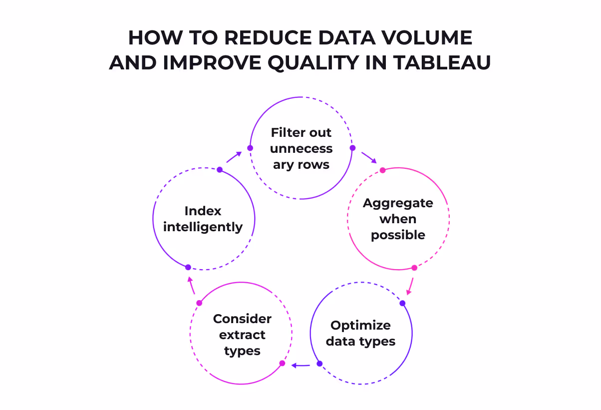
Reducing your dataset to only what's necessary is perhaps the single most effective performance boost. Here's how to slim down your data:
Apply data source filters to limit records to just the relevant time period. This dramatically reduces extract size.
Pre-aggregate data at the database level before loading into Tableau. If you're visualizing monthly trends, you don't need daily data.
Strings and dates process slower than numbers and Booleans. Consider converting string-based IDs to numbers when possible.
Extracts are a quick way to make most workbooks run faster. They provide a snapshot of data optimized for aggregation and stored in memory, enabling faster visualization.
Within your database, index and cluster where it makes sense. This speeds up queries before data even reaches Tableau.
Here's a crucial insight many overlook: live connections continuously query the database with each interaction, whereas extracts process in Tableau's memory. Unless you absolutely need real-time data, extracts generally perform better.
Not sure what to keep or cut from your layout?
Darwin can help you redesign for clarity and speed. Book a free layout performance review with our team today.
How to eliminate irrelevant data fields
Rarely will you have a data connection containing only what you need. Typical connections include many unnecessary columns. As your workbook takes shape, you'll quickly realize what you don't actually need.
To hide a field in Tableau, right-click it in the Data window and select "Hide". Hidden fields appear gray in the Data window and importantly, they aren't included when you create or refresh extracts.
Our preferred approach is letting Tableau automatically handle this cleanup. Before creating an extract, simply select the "Hide All Unused Fields" button in the extract dialog box. In a real example, this reduced one dataset from 30 fields to just 15—cutting the extract size in half!
Remember this essential point: once you've hidden fields, they no longer appear in the Data window. If you need them later, you can right-click your data source, uncheck "Use Extract," and then show hidden fields from the dropdown menu.
The cleaner your data is and the better it matches your analytical questions, the faster your dashboards will run. This isn't just about performance—it's about creating the foundation for smooth, responsive visualizations that deliver insights without the wait.
Sometimes the most beautiful dashboards are also the slowest. You've probably seen those intricate visualizations with fifteen different charts, animated filters, and flashy effects. They look impressive in demos but crawl in real-world situations. Smart layout choices can dramatically speed up your Tableau dashboards.
The majority of slow dashboards stem from poor design decisions—specifically, cramming too many charts onto a single dashboard or trying to display excessive data at once. Users abandon dashboards after just two seconds of waiting, so performance isn't optional—it's crucial.
Think about what happens behind the scenes: each visualization on your dashboard creates its own query. With too many charts, Tableau must execute multiple complex queries simultaneously, significantly increasing load times. Large crosstabs with numerous quick filters can cause painfully slow response times when users attempt to view all dimensions.
Excessive marks (data points) on a view not only slow things down but also diminish the analytical value of your visualization. Floating objects render less efficiently than tiled layouts, so your artistic design choices directly impact performance.
White space isn't just about making things pretty—it serves a functional purpose in dashboard design. It's the untouched, empty area between elements that helps users process information more quickly.
Consider adding padding around your visualizations. From the Layout pane, select dashboard elements and adjust both outer and inner padding. This seemingly small change gives labels and legends room to "breathe" and makes your dashboard more scannable. For most cases, padding values between 15-25 pixels work well.
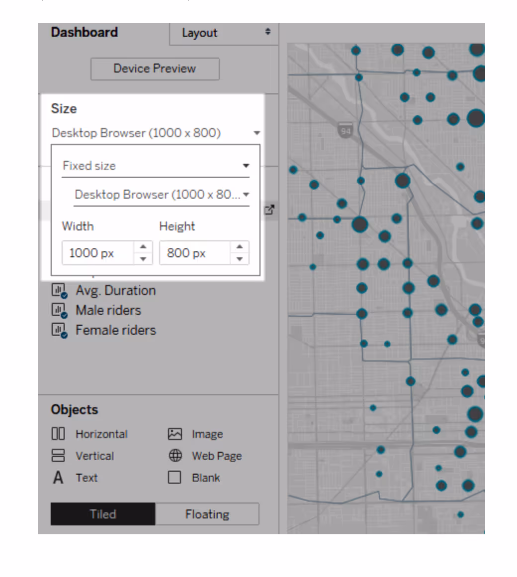
Start by sketching out your dashboard dimensions in advance. If your dashboard is 1024 pixels wide with three layout containers and 25 pixels of spacing between them, each container should be approximately 308 pixels wide. This planning prevents the cluttered look that slows both rendering and comprehension.
Fixed-size dashboards load faster because they're more likely to use cached versions on the server. Dashboards with variable sizes must be freshly rendered for every browser request, causing performance delays.
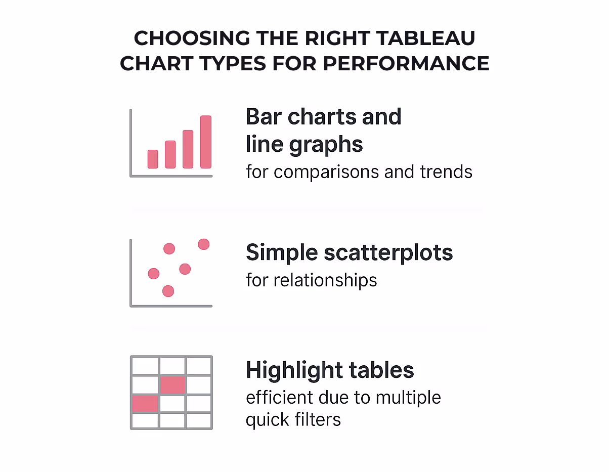
Chart selection impacts both visual clarity and processing speed. Consider these performance-friendly options:
These classic chart types render quickly and effectively communicate comparisons and trends.
Effective for showing relationships, but limit the number of marks to maintain performance.
More efficient than large crosstabs with multiple quick filters.
Complex visualizations with many marks (like detailed scatter plots or high-density maps) significantly slow dashboard performance. Sometimes the best approach is implementing "guided analytics"—connecting simpler views with action filters instead of trying to show everything at once.
Rather than fitting everything into a single view, compile related views and connect them with action filters. This allows users to travel from overview to granular views smoothly without overwhelming the system. As a general rule, limit your dashboard to 2-3 views for optimal performance and visual clarity.
Remove unneeded dimensions from the detail shelf and explore alternative chart types if your current visualization feels sluggish. The goal is presenting your data story through the most efficient visual means possible.
Filters may seem like simple controls, but they're often the hidden culprits behind sluggish dashboards. I've watched countless beautiful Tableau visualizations crawl to a halt the moment someone clicks a filter dropdown. Here's what most people don't realize: not all filters are created equal—some can help performance while others can absolutely tank it.
Understanding the filter hierarchy is crucial for performance tuning. Tableau processes filters in this specific order:
Extract filters should be your first line of defense since they reduce data volume right from the start. These filters permanently remove data before it even gets to Tableau, creating a smaller dataset that's inherently faster to process.
Data source filters come next, applying at the connection level to further refine what data reaches your workbook. These are particularly valuable for security—limiting what certain users can see while simultaneously improving performance.
Context filters can be tricky. Despite common belief, they aren't a magic performance boost—in fact, they create a temporary table that can sometimes slow things down. Use context filters primarily when you need to:
Action filters deserve more attention than they usually get. They're triggered by specific user interactions rather than applying to the entire dataset continuously. This targeted approach makes your dashboard far more responsive during exploration.
High-cardinality refers to fields with many unique values—think customer IDs or transaction numbers. These fields make terrible quick filters because Tableau must query and load all possible values. When a quick filter needs to display thousands of options, your performance takes a massive hit.
If you absolutely must filter on high-cardinality fields, use wildcard matches or custom value lists instead. With wildcard filters, users type a few characters, and Tableau returns matching values without loading the entire set of options.
Another filter trap is the "exclude" option. When you choose to exclude values, Tableau runs more complex queries compared to inclusion filters. This added complexity requires more processing power and time—so whenever possible, frame your filters as inclusions rather than exclusions.
Date fields default to discrete in Tableau (those blue pills), but continuous date filters (green pills) perform significantly better. Continuous date filters treat dates as a range rather than individual categories, requiring less processing power.
Relative date filters are another performance booster. They dynamically update to show relevant time periods without manual adjustment. This approach is not only more efficient but also ensures your dashboard always shows current data.
Lastly, whenever possible, use integers, numbers, or booleans for filtering instead of strings. These simpler data types process more quickly and efficiently, requiring less computational power and memory to filter large datasets.
Remember that each filter generates its own query, and filters like "Only Relevant Values" multiply that query load substantially. The golden rule of performance optimization? Less is more when it comes to filters.
"The majority of slow dashboards are caused by poor design – in particular, too many charts on a single dashboard, or trying to show too much data at once." — Tableau Documentation Team, Official Tableau Product Documentation Authors
Visual clutter is the silent killer of Tableau performance. I've seen plenty of dashboards that look impressive at first glance but take forever to load—all because they're trying to show too much at once.
Even the most well-structured data and carefully planned layouts can't save you if your dashboard is drowning in unnecessary visuals. This isn't just about aesthetics—it's a fundamental performance issue that affects every user interaction.
Each worksheet in your dashboard runs one or more queries against the data, so the more sheets you add, the longer it takes for everything to render. This creates a compound effect on performance.
Consider what happens behind the scenes: every visualization requires Tableau to process and render data points (marks). The more marks on your view, the more processing power and memory required. You can check your mark count in the lower left corner of Tableau Desktop—it's a number worth watching.
Complex visuals like maps with custom polygons and large crosstabs are especially demanding. But here's what many people don't realize: dashboards overloaded with charts aren't just slow—they actually diminish analytical value by causing information overload.
Be ruthless about what deserves a spot on your dashboard. The majority of slow dashboards result from poor design choices—primarily trying to cram too many charts onto a single dashboard.
Here are practical ways to simplify:
Simplicity isn't just about performance—it's about clarity. Allow your users to incrementally drill down to details instead of overwhelming them with everything upfront.
Tooltips are a brilliant way to provide depth without cluttering your main view. When someone hovers over a mark, the tooltip can display relevant data and even another visualization filtered to that mark. This approach helps users engage with data at a deeper level while keeping the main view clean and fast.
Be careful not to overdo tooltip visualizations. Keeping these views simple helps with performance and reduces cognitive load. They're perfect for showing time trends or breakdowns without adding another full chart to your dashboard.
Drill-downs represent another powerful technique. Instead of fitting everything into a single view, compile related views and connect them with action filters. This approach lets users travel from overview to granular views smoothly—what Tableau calls "guided analytics." It's much more efficient than cramming everything onto one screen, both for performance and user comprehension.
The key principle here is progressive disclosure—show users what they need when they need it, rather than everything all at once. This approach not only speeds up your dashboard but also creates a more engaging user experience.
Behind every sluggish Tableau dashboard often lurks a tangle of complex calculations eating up processing power. I've watched users pile on nested formulas, wondering why their beautiful dashboard suddenly feels like it's running through molasses.
Think of calculations as the engine under your dashboard's hood—powerful but potentially costly. Complex expressions can increase execution times dramatically, with studies showing they can slow dashboard performance by up to 30%. Research indicates that approximately 65% of all performance issues stem directly from overly complex calculations.
The location of your calculation matters tremendously. Row-level calculations (those performed on each individual row) force Tableau to work much harder. Simply transitioning to aggregate-level calculations can cut processing time in half. Organizations optimizing their calculation approach have seen dashboard performance improvements by as much as 25%.
The beauty of efficient calculation design lies in simplicity. Consider these approaches:
Perhaps surprisingly, CASE statements often outperform Tableau's built-in grouping functionality. This happens because built-in grouping loads the entire dimension domain, whereas calculated fields using CASE only load the specific members you've identified.
Since the 2022.1 release, Tableau has included a workbook optimizer that examines your calculations against best practices. To access it, simply click "Server" from the top menu bar and select "Run Optimizer".
The optimizer identifies issues affecting performance speed and provides practical solutions. It evaluates your workbook against 20 best practice guidelines, categorizing problems into "Take Action" (quick fixes) and "Needs Review" (more complex issues).
Some guidelines even offer the option to "Fix the rule" automatically, like hiding unused fields. This tool identifies excessively long calculations (over 600 characters), unnecessary nested calculations, and opportunities to materialize calculations in extracts.
By routinely running this optimizer, you'll consistently identify problematic calculation patterns before they slow down your dashboards.
Your dashboard looks flawless on your desktop. But here's what most people miss: that same dashboard might be practically unusable on your client's tablet or your boss's phone. Cross-device testing isn't just a nice-to-have—it's critical for ensuring your performance optimizations actually work where they matter most.
I've seen too many perfectly optimized dashboards fall apart the moment someone tries to use them on a mobile device. Different screen sizes and processors handle your carefully crafted visualizations differently. The dashboard layout a device displays depends on the smallest dimension of the iframe where your Tableau view appears.
What works perfectly on your development machine might crawl on another device. That's why testing across multiple environments gives you the complete picture of your dashboard's real-world performance.
Mobile dashboards with poor testing see bounce rates increase by 40%.
Darwin ensures seamless performance across all devices. Get a device-agnostic dashboard audit.
Don't wait until your dashboard contains sensitive production data to test performance. Start with dummy data that mimics your actual dataset's structure and volume. You can generate customized, business-relevant dummy data quickly, tailored specifically for Tableau dashboard testing environments.
Once you've created a representative dataset, run performance tests before deploying. This helps identify bottlenecks without risking exposure of confidential information. Test with varying data volumes to understand how your dashboard scales as your dataset grows.
The real test comes from actual users. Consider implementing feedback mechanisms directly within your dashboards. Tools like Microsoft Forms can be integrated into Tableau to collect user experiences. This direct feedback loop is invaluable for ongoing optimization.
Before diving deep into testing, consider your end users' needs. Dashboards answer many questions and allow for exploration, so ensure yours remains digestible. Check if your dashboard automatically looks good across devices by clicking 'device preview.' For small screens, limit objects to essentials—start by removing unnecessary views, filters, titles, and legends.
Remember to test published dashboards by viewing them from different browser sizes. In Tableau Server or Cloud, copy the embed link and test different layouts by resizing your browser window.
Dashboard size settings might seem like a minor detail, but they pack a major performance punch. Fixed-size dashboards consistently outperform their automatically-sized counterparts in speed tests, often by surprising margins.
Here's what most people don't realize: fixed dimensions create predictability that Tableau loves. When you choose fixed dimensions, Tableau can better cache the results since it knows exactly what size to prepare. Published dashboards with fixed sizes load faster primarily because they're more likely to use a cached version on the server.
Think about what happens during the rendering process. Tableau needs to create a dashboard layout, decide how many axis ticks to draw, determine positions for mark labels, and calculate rows and columns to display. All these decisions depend on the window size. With fixed dimensions, this work happens once and gets reused.
Dashboards with automatic sizing? They must be freshly rendered for every browser request, causing noticeable performance delays. Sure, responsive elements are common in web design, but letting your dashboard resize can distort the layout of your content in addition to the performance impact.
Every visualization you add increases the number of queries Tableau must execute and marks it needs to render. This creates a compound effect on load times—each additional chart multiplies the work required.
Here's a simple rule: if you have more than 5 visualizations on your dashboard, it's time to consider breaking things up. A dashboard must load all elements before displaying anything, meaning the more views it contains, the longer users wait.
Tableau gives you the ability to create device-specific dashboards to better serve users on phones or tablets. But here's the thing: if these aren't actually required by your audience, removing them creates a smaller file that loads faster.
For small screens, limit the number of objects to just those truly needed. Ask yourself: "What's the essential information I want to convey?" Start by removing unnecessary views, filters, titles, and legends to save precious screen space.
Unless you specifically need to show wide map views or timelines, prioritize optimizing your dashboard for phones vertically. If you need to include many views for small screens, 'fit width' is often better as it allows users to scroll vertically.
Action filters and hidden containers might sound like technical jargon, but they're really game-changers for dashboard performance. I've seen these two features transform clunky, slow visualizations into responsive analytics that users actually enjoy using.
Here's what makes action filters so powerful: unlike standard filters that load all data possibilities upfront, action filters work on demand—fetching data only when users interact with specific elements. They send information between worksheets based on what you click or hover over, essentially creating targeted queries instead of processing everything at once.
Action filters shine because they reduce initial data load significantly. Rather than loading all detailed information when the dashboard opens, Tableau fetches data dynamically upon user interaction. This targeted approach means your dashboard responds faster during exploration.
You can set up action filters to run when users hover over marks, click on them, or select from a tooltip menu. Even better, you can configure what happens when selections are cleared—whether to keep filtered values, show all values, or exclude everything.
Hidden containers are floating elements that users can toggle on and off, perfect for tucking away details until they're needed. To implement them, place everything you want to hide in a floating container, select it, and tick "Add Show/Hide Button".
This approach optimizes dashboard space and prevents information overload. Consider hiding elements like:
The magic happens when you combine these techniques. Use action filters to let users click a region on a map to filter related charts. Then employ hidden containers to reveal additional analytics only when needed.
This progressive disclosure approach creates a guided experience—showing users what they need when they need it, rather than overwhelming them with everything at once. Given that dashboard space is valuable, dynamic zone visibility lets you hide or reveal zones based on field values or parameters.
Remember that hidden elements don't execute queries until revealed—a significant performance advantage. Just be mindful that people don't usually interact with show/hide buttons without prompting, so provide clear visual cues or instructions for interactive elements.
Need a quick way to compare all these optimization strategies? Here's everything we've covered in one handy reference table.
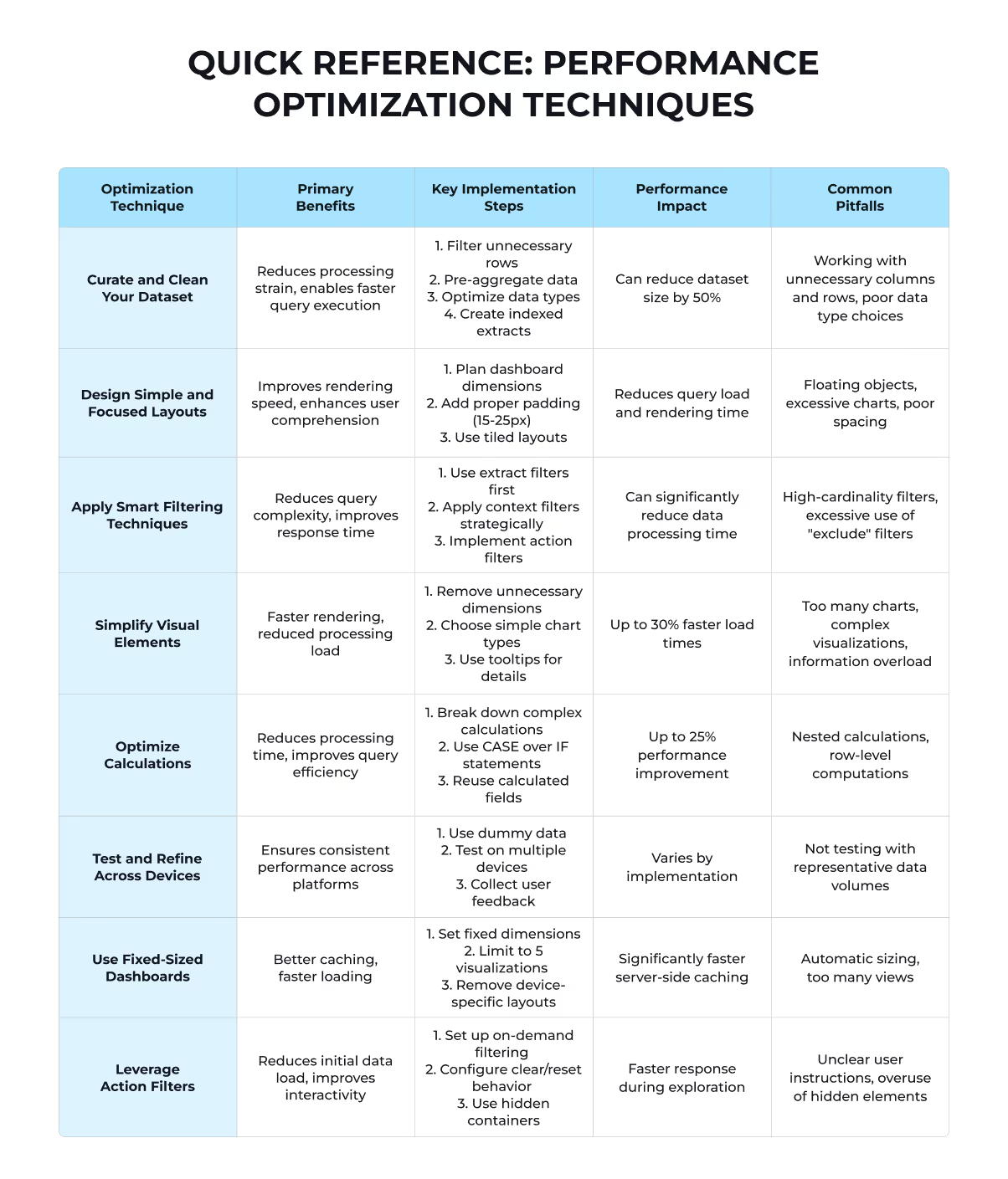
The beauty of this table? You can tackle these optimizations in any order that makes sense for your specific situation. Start with the biggest pain points in your current dashboard, then work your way through the rest.
Speed matters when it comes to Tableau dashboards. Your users expect instant results, and waiting even a couple of seconds sends them clicking elsewhere. The eight optimization techniques we've covered work together to create lightning-fast visualizations that keep your audience engaged.
Still struggling with sluggish dashboards despite your best efforts? Contact Darwin for expert guidance when you need help implementing these advanced performance techniques. Sometimes an experienced perspective can identify bottlenecks you might have missed.
FAQs
Q1. What are the most effective ways to speed up a Tableau dashboard? Clean and curate your dataset, simplify dashboard layouts, use smart filtering techniques, optimize calculations, and leverage action filters. These methods can significantly reduce data processing time and improve overall performance.
Q2. Why might my Tableau dashboard be running slowly? Slow performance is often due to poor design choices, such as including too many charts on a single dashboard or attempting to display excessive data at once. Simplifying your design and implementing guided analysis can help improve speed.
Q3. How can I enhance the performance of Tableau extracts? To improve extract performance, keep your dataset concise by filtering or aggregating data, and narrow it down by hiding unused fields. You can use the "Hide All Unused Fields" and "Aggregate data for visible dimensions" options in Tableau Desktop to make these changes.
Q4. What are some key strategies for optimizing dashboard performance? Focus on reducing data volume, optimizing data structure, eliminating irrelevant data, improving data quality, enhancing user experience, and limiting date ranges. These strategies can help streamline your dashboard and improve its overall responsiveness.
Q5. How do fixed-size dashboards impact Tableau performance? Fixed-size dashboards generally load faster because they're more likely to use cached versions on the server. They create predictability that Tableau can optimize for, unlike automatically-sized dashboards which must be freshly rendered for every browser request.
Reach out to Darwin—our Tableau experts are ready to pinpoint your performance blockers and fix them fast.
Contact Darwin now