Learn how a cohesive visual language can strengthen your brand identity, enhance audience loyalty, and increase mental availability. Make your design count.
When it comes to brand messaging, design plays a pivotal role in conveying the message. You’re right; the words do matter as well, but 55% of brand first impressions are visual.
That’s why companies can’t neglect their brand identities, trust, and credibility. Diluted messaging, just like diluted brand perception, is too weak to engage visitors and impact their decisions.
But unfortunately, the trouble around mixed-up design doesn’t stop here. It often severely affects the user experience across all touchpoints, puts breaks on effective communication, and, ultimately, undermines marketing efforts.
The latter is strikingly draining in terms of budget and performance.
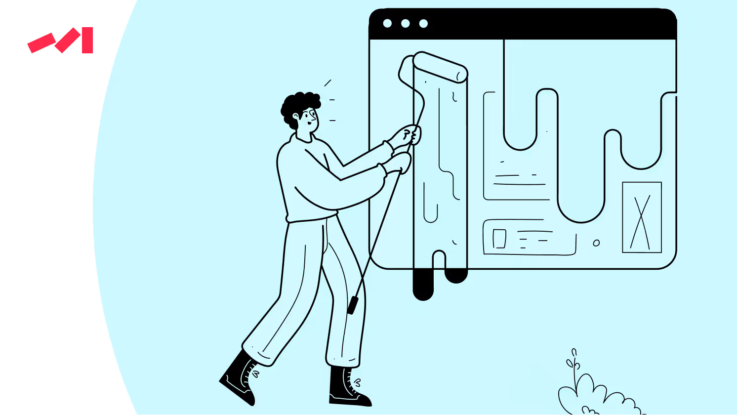
The lack of a cohesive visual language nullifies brand messaging and its strategies. Messages, or their intents, can't be delivered correctly, which prevents users from engaging with content meaningfully.
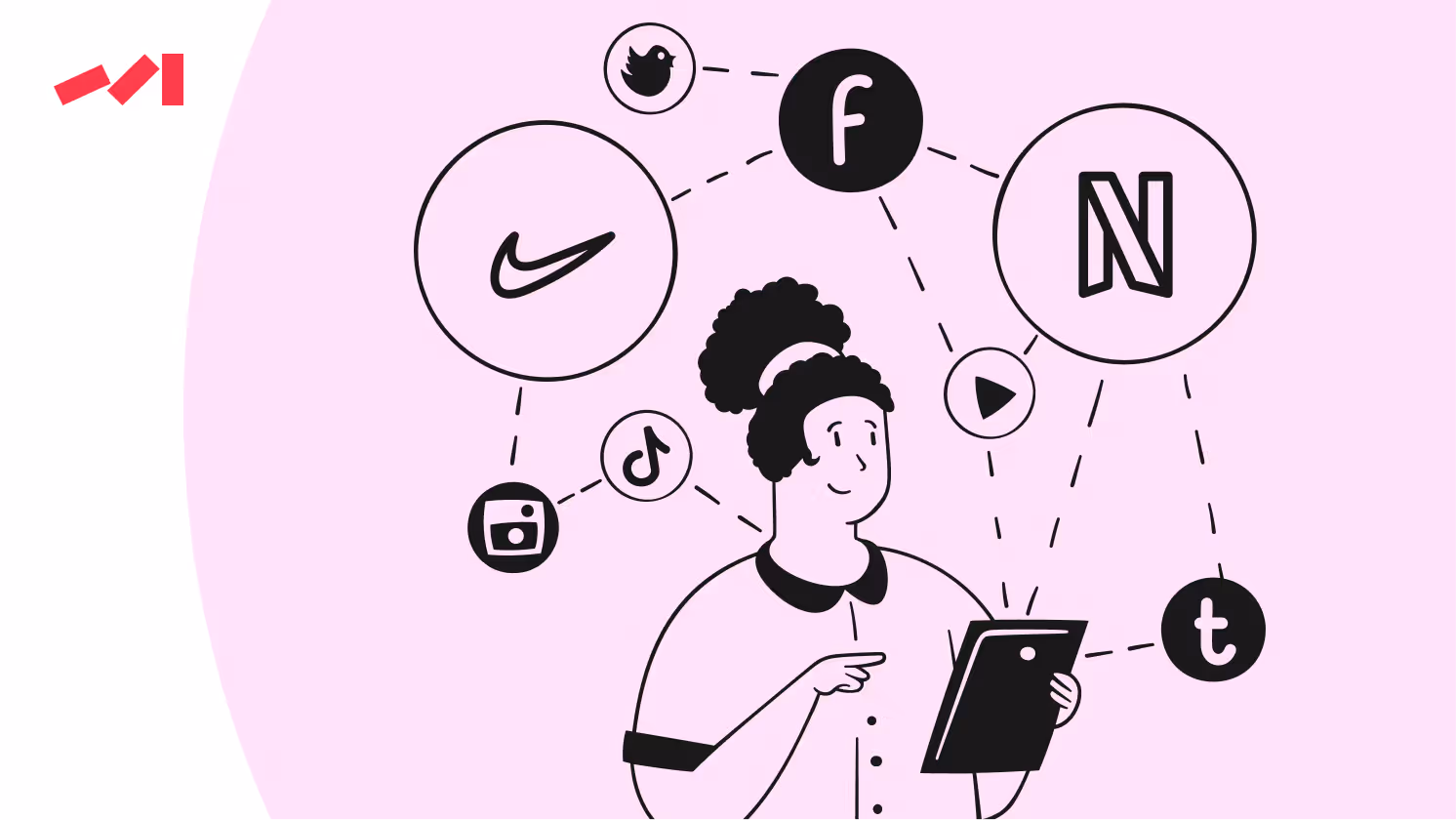
Each interaction on any platform should reinforce the brand's narrative and build an emotional connection with it. When the design is mixed up, the brand’s narrative becomes fragmented, and critical messages may be lost or misinterpreted.
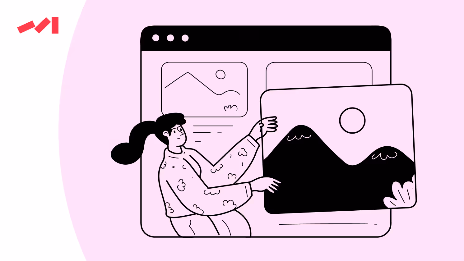
A unified design, essential for creating a seamless visual experience, highlights brand identity and messaging. When the opposite is true — icons, buttons, and graphical styles vary across different parts of a website — users feel confused and mistreated. This feeling toward the brand ruins all the efforts to land on your platform in the first place.
Navigation is vital to a user's experience. It’s like a beacon that guides users through the brand's offerings and information architecture.
Suppose users struggle to find information or navigate between sections due to inconsistent or illogical layouts. In that case, they are less likely to deepen their interest in your offerings and more likely to seek alternatives. Moreover, poor navigation design can reflect negatively on the brand's competency and reliability, crucial for maintaining user trust and engagement.
Typography and color are foundational elements for successful visual communication. They play crucial roles in readability and emotional impact.
If inconsistent, typography can distance users. Think of multiple fonts or varying sizes without a clear hierarchy. They raise our brows.
The same holds true for erratic color usage. A riot of color does nothing but disrupt the visual harmony and emotional cues. For example, if a brand uses blue to signify trust and calm in one section but uses the same blue inconsistently in other contexts, it takes away from the intended emotional response.
A small detail? Color raises brand recognition by up to 80%.

It’s highly effective to approach brand identity strategically. Strategy is the key, and only then does the power of consistency kick in. When you’ve created your brand identity, consistent application is so critical to make it stick as a highly recognizable, stand-out brand.
So, how do you do it?
Begin by evaluating your current visual language and UI elements. Color, typography, and icons should all be gathered together in one place and thoroughly analyzed. By doing so, you’ll get a better view of the visual narrative currently offered to your users — its gaps and setbacks.
It’s also important to invest your time in zooming in on navigation paths and interface layouts to spot what elements make the flow of your website overly complicated or where there’s no connection between related sections.
Armed with the data and insights gained from the audit, we establish a clear visual hierarchy. When a visual language is in place, messages cannot be overlooked. Information architecture serves as a guide to brands’ priorities and messaging strategy.
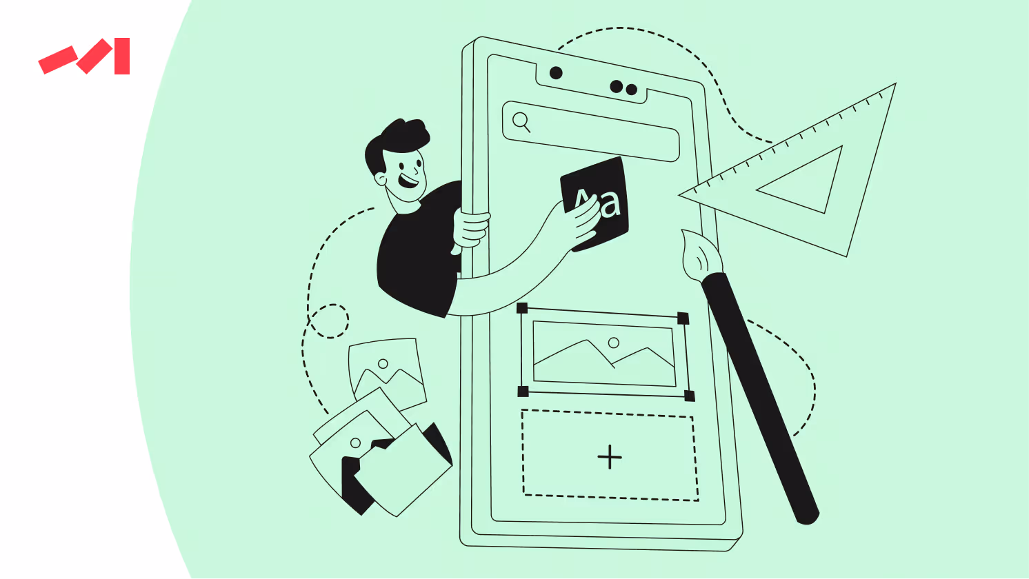
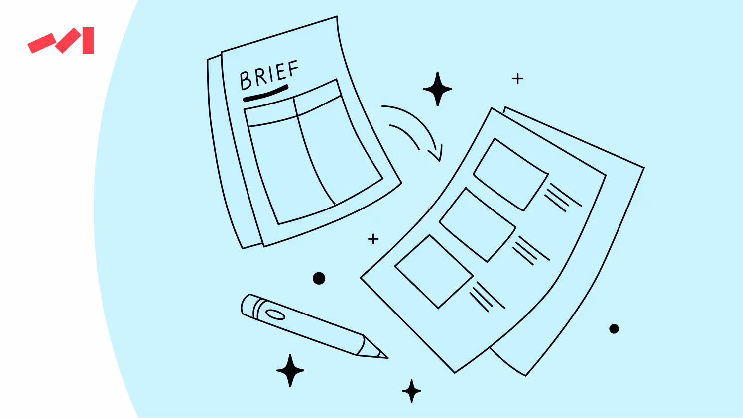
To redesign essential UI components based on the newly defined visual language, you can utilize Figma, a design tool. Working on this one, you not only add consistency and cohesion to your visual outlook but connect customer journeys with brand messages across various user scenarios.
What comes next is clear and obvious: rigorous testing and adjusting of UI components to guarantee visual and functional consistency across different screen sizes and devices.
Quality design is key to effective marketing. It captures attention, increases engagement, and drives conversions.
Before you go, subscribe to our newsletter to learn how strategic design decisions can transform your marketing efforts and help your business stand out.
Don’t miss out on the opportunity to learn more and stay updated on the latest trends!
Book a free 30-minute call with Darwin's Head of Design to brainstorm and fire off questions about the project you're racking your brain about. In this session, you'll gain a design concept idea developed on the spot, providing a solid starting point for your design journey.
Book a Design Concept Idea Call


.avif)


