
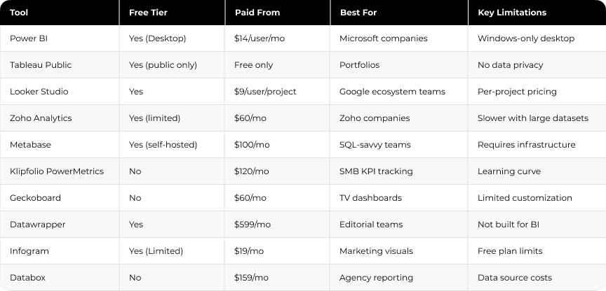
10 affordable data visualization tools compared by price, features, and use case. Find the right fit for your team without overspending.
Quick Answer:
The most affordable data visualization and dashboard tools in 2026 include Power BI, Looker Studio, Zoho Analytics, Metabase, and Databox. Free options work well for small teams and Google-based workflows, while paid plans usually range from $9 to $319 per month. The right choice depends on your data sources, team size, reporting needs, and how quickly you need dashboards in place.
TL;DR
Spreadsheets often become difficult to manage once reporting needs grow faster than the available budget. Raw numbers scattered across platforms make it harder to understand what is happening across the business. Data visualization tools solve this by turning that information into charts and dashboards teams can use to make decisions.
"Data visualization is the language of decision making. Good charts effectively convey information. Great charts enable, inform, and improve decision making." — Dante Vitagliano, Founder, Trailmapper
This guide covers 10 affordable data visualization tools worth considering in 2026, comparing features, pricing, and the situations where each option makes sense.
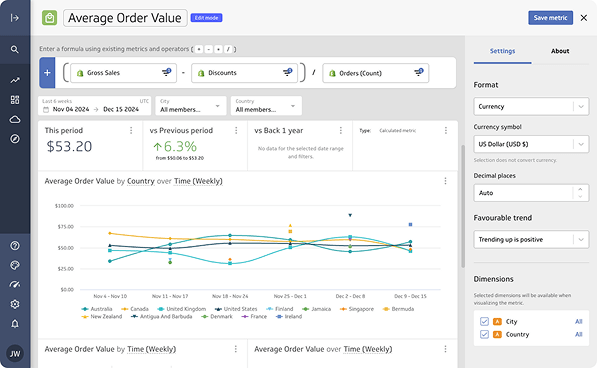
Power BI is the go-to choice for organizations running Microsoft infrastructure. The free Desktop version handles solo reporting well, while paid plans unlock team collaboration. It’s one of the most widely used dashboard and data visualization tools across enterprise and mid-market teams.
Power BI Desktop connects to over 100 sources, including databases, cloud services, Excel files, and web APIs. Power Query handles data transformation without code. AI integration through Copilot allows users to ask questions in plain English and generate charts automatically. Dashboards update in real time, with scheduled refresh running up to eight times daily on Pro licenses.

Pros
Cons
Microsoft-based organizations already working in Excel, Teams, or Azure. Companies that need shared dashboards and centralized reporting across departments. Smaller teams can begin with the free Desktop version.
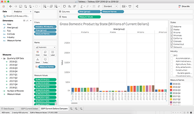
Tableau Public is a fully free platform with strong data visualization capabilities. The trade-off is privacy: everything published becomes publicly accessible. Since its launch in 2010, the platform has attracted more than five million users who have created over 11 million public dashboards and visualizations.
The drag-and-drop interface requires no coding. Users can connect to Excel, Google Sheets, text files, and web data connectors, with support for datasets of up to 15 million rows per source. The platform includes standard chart types as well as heat maps, scatter plots, and custom visualizations.
Completely free. No subscription, no credit card, and no expiration. The main limitation is that all published dashboards remain publicly accessible.
Pros:
Cons:
Students, academics, and professionals building analytics portfolios. Not suitable for work involving confidential or proprietary data.
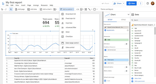
Google rebranded Data Studio as Looker Studio in 2022. The free tier remains one of the more generous options in this category, offering unlimited reports and 24 native Google connectors. For teams working with data sources across the Google ecosystem, it is often the natural starting point.
Native connections include Google Analytics, BigQuery, Google Ads, YouTube Analytics, and Google Sheets. The platform supports 36 chart types and real-time collaboration. Users can blend up to five sources in a single report, with custom calculations and dynamic filtering available throughout.
Pros:
Cons:
Marketing teams tracking Google Ads and Google Analytics. Small businesses operating in Google Workspace. Agencies building client reports using Google-native data sources.
Zoho Analytics earned recognition in the 2025 Gartner Magic Quadrant for Analytics and BI Platforms for the fourth consecutive year. The platform connects to more than 500 data sources and includes pre-built reports for over 100 popular business applications.
The Ask Zia AI assistant allows users to skip manual report building. Users can type a question such as “show me the top five products sold last quarter” and receive a chart automatically. Refresh rates depend on the selected plan, ranging from daily syncs on the free tier to up to 24 refreshes per day on paid plans.
Pros:
Cons:
Companies already running several Zoho products and wanting reporting inside the same ecosystem. Small and mid-sized businesses that need a centralized reporting layer across multiple business apps.
Metabase started as an open-source BI platform and remains one of the few tools that gives teams full functionality at no licensing cost. More than 90,000 companies use it, provided they manage their own hosting.
Metabase supports two common workflows. Non-technical folks use the point-and-click query builder, while analysts write custom SQL directly. Both approaches generate the same visualizations, just different paths getting there. Metabase connects to all major databases plus community-built connectors, pulling data from PostgreSQL, MySQL, MongoDB, and dozens more.
Metabot AI handles natural language queries and SQL generation, though it costs extra starting at $100 monthly for 500 requests. Static embedding comes free with a "Powered by Metabase" watermark, while interactive embedding requires Pro plans. The usage analytics dashboard shows how people actually use your instance, helping you spot adoption patterns.
Pros:
Cons:
Teams with SQL-proficient analysts. Startups and small businesses willing to manage hosting in exchange for zero licensing cost.
PowerMetrics sits between basic dashboard builders and enterprise BI platforms. It is designed for small and mid-sized teams that need reliable reporting without complex setup.
More than 130 data integrations cover spreadsheets, data warehouses, and cloud services. Reusable data feeds combine account connections with visual components, allowing teams to reuse the same data across multiple metrics. Dashboards can be displayed on TV screens, mobile devices, or delivered through scheduled PDF email reports.
Pros:
Cons:
Small and mid-sized businesses replacing manual reporting. Teams consolidating KPIs from multiple applications with analysts comfortable working with formulas.
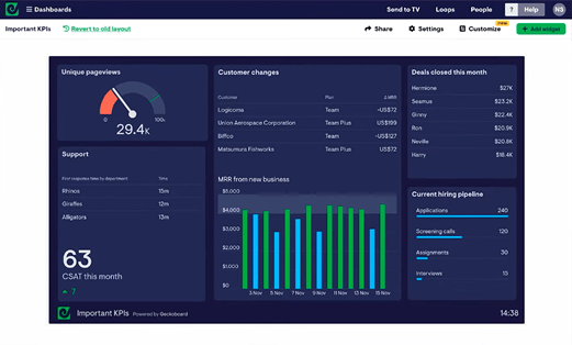
Geckoboard focuses on one specific use case: displaying live metrics on office screens so teams can monitor performance throughout the day. The platform supports more than 90 data sources, with real-time updates that can refresh as often as every minute.
Dashboard setup takes only a few minutes and works with Smart TVs or small PC devices connected to screens. Integrations include many common business tools such as Salesforce, HubSpot, and Google Analytics.
Additional dashboards, editors, and viewers are available as paid add-ons.
Pros:
Cons:
Customer service teams monitoring support queues during the day. Sales teams displaying live KPIs on office screens.
Setting up reporting dashboards for your team? Darwin can design the setup and connect your sources.
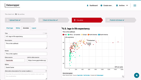
Datawrapper was built for journalists and remains widely used by editorial teams. Its workflow is intentionally simple: paste data, select a chart type, and publish.
The platform offers more than 25 interactive chart types, along with symbol maps, choropleth maps, and locator maps. Google Sheets integrations allow charts to update automatically when the underlying data changes. Charts are GDPR compliant by default and include no tracking code when embedded.
Pros:
Cons:
Journalists, researchers, and content teams that need embeddable charts quickly. Not suitable for complex business intelligence or multi-source reporting.
Setting up reporting dashboards for your team? Darwin can design the setup and connect your sources.
Infogram is designed for marketing and communications teams that regularly create infographics and visual reports without relying on a dedicated design team. The platform is used by more than 10 million people worldwide.
The platform includes more than 35 interactive chart types, over 800 map variations, and a library of one million royalty-free images and icons. AI-assisted suggestions help identify suitable chart formats based on uploaded data. Brand kit features keep visuals consistent, while real-time collaboration allows multiple contributors to work on the same project.
Annual billing reduces pricing by about 24 percent.
Pros:
Cons:
Marketing teams producing social graphics and visual reports. Companies that prefer a single tool for charts, infographics, and basic design assets.
Databox focuses on fast dashboard deployment. More than 500 pre-built templates and over 130 native integrations allow teams to start tracking metrics shortly after setup.
Unlimited users are included on all plans. AI identifies trends and sends alerts without manual configuration. There are no hidden limits on team members or custom metrics.

Pros:
Cons:
Agencies managing multiple client accounts. Small and mid-sized businesses that want automated reporting without maintaining complex analytics infrastructure.
Your dashboards are only as good as the data behind them. Darwin makes sure it's clean and connected.
Picking the right tool isn't about features alone. Most teams evaluate based on what admins can do, then wonder why adoption remains low. Smart selection requires testing with your least technical user.
Pricing looks simple until you scale. A tool affordable for five users can get expensive at fifty. Watch for features gated behind higher tiers, specifically data connectors, automated refresh, and AI capabilities. Query limits, row caps, and storage restrictions can affect performance in ways that surface only after migration. Factor in implementation time too. A cheaper tool taking three months to set up costs more than a pricier option running in two weeks.
Your data lives everywhere: databases, warehouses, CRM, ERP, marketing platforms. The tool needs prebuilt connectors, API support, and compatibility with various file formats. Organizations should define their data volume upfront to avoid problems later.
If your users are analysts, SQL support matters. If they're marketers or executives, drag-and-drop dashboards matter more. AI data visualization tools help non-technical users create visualizations faster. When your team includes varied skill levels, test during trials with actual end users, not just admins.
A quick overview of all tools by starting price, free tier availability, and primary use case.
"Information is the oil of the 21st century, and analytics is the combustion engine." — Peter Sondergaard, former SVP & Global Head of Research, Gartner
Not sure which tool fits your workflow and budget? Darwin helps teams choose and set up the right stack.
Choosing a visualization platform is only one part of the process. Dashboards become useful when they are connected to reliable data sources and structured reporting environments.
Many teams use tools such as Power BI, Looker Studio, or Databox to build dashboards, but the real challenge is integrating those tools with CRM platforms, marketing systems, and internal data sources.
In projects like the reporting environment built for Potomac Floral, dashboards connected directly to operational data sources reduced report load times from more than ten minutes to under twenty seconds.
Darwin works with B2B marketing and RevOps teams to design analytics setups where dashboards update reliably and metrics remain consistent across systems.
This work typically includes:
With the right foundations in place, companies can expand their analytics stack without rebuilding reporting processes each time a new tool is introduced.
Q1. What's the difference between free and paid data visualization tools?
Free tools usually limit where dashboards are stored, how many data sources can be connected, or how often reports refresh. Paid plans typically add private dashboards, collaboration features, and faster data updates.
Q2. Which data visualization tool is best for small businesses on a tight budget?
Looker Studio works well for teams already using Google products. Zoho Analytics offers a functional free tier with built-in support. Metabase is also a strong option for teams willing to manage self-hosting.
Q3. Can data visualization tools be used without coding knowledge?
Yes. Most modern platforms include drag-and-drop interfaces designed for non-technical users. Some tools also support SQL queries for advanced analysis, but coding is not required for everyday dashboards.
Q4. How do I know which tool integrates with my existing software?
Check the list of native integrations before choosing a platform. Tools such as Power BI, Looker Studio, and Databox connect with dozens or hundreds of common business systems. If your stack includes niche tools, confirm whether API access or custom connectors are available.
Q5. What should teams consider besides price when choosing a dashboard tool?
Cost is only one factor. Teams should also evaluate integration support, refresh frequency, and how easily dashboards can scale as reporting needs grow.
Contact Darwin today for a custom SEO strategy that combines the best automation tools with proven tactics to dominate Google and AI search results.
Talk to us


.avif)